We are here to answer any question you may have. Feel free to reach via contact form.
E-commerce redesign with a scalable design system
I led a strategic redesign focused on content clarity and modularity, to address low customer engagement and poor product differentiation on Staples’ Print & Marketing landing pages.
Beyond the UI overhaul, I established the foundation of a design workflow and dual-library system. This initiative not only launched a superior customer experience for the category and product landing pages but established a scalable framework that accelerated design and development cycles for future rollouts.
Category
E-commerce
Tools
Figma, UserTesting, FullStory
HEAR THE STORY
0:00/--:--
01
Strategic Alignment
Facilitating early collaboration to define content needs and technical feasibility.
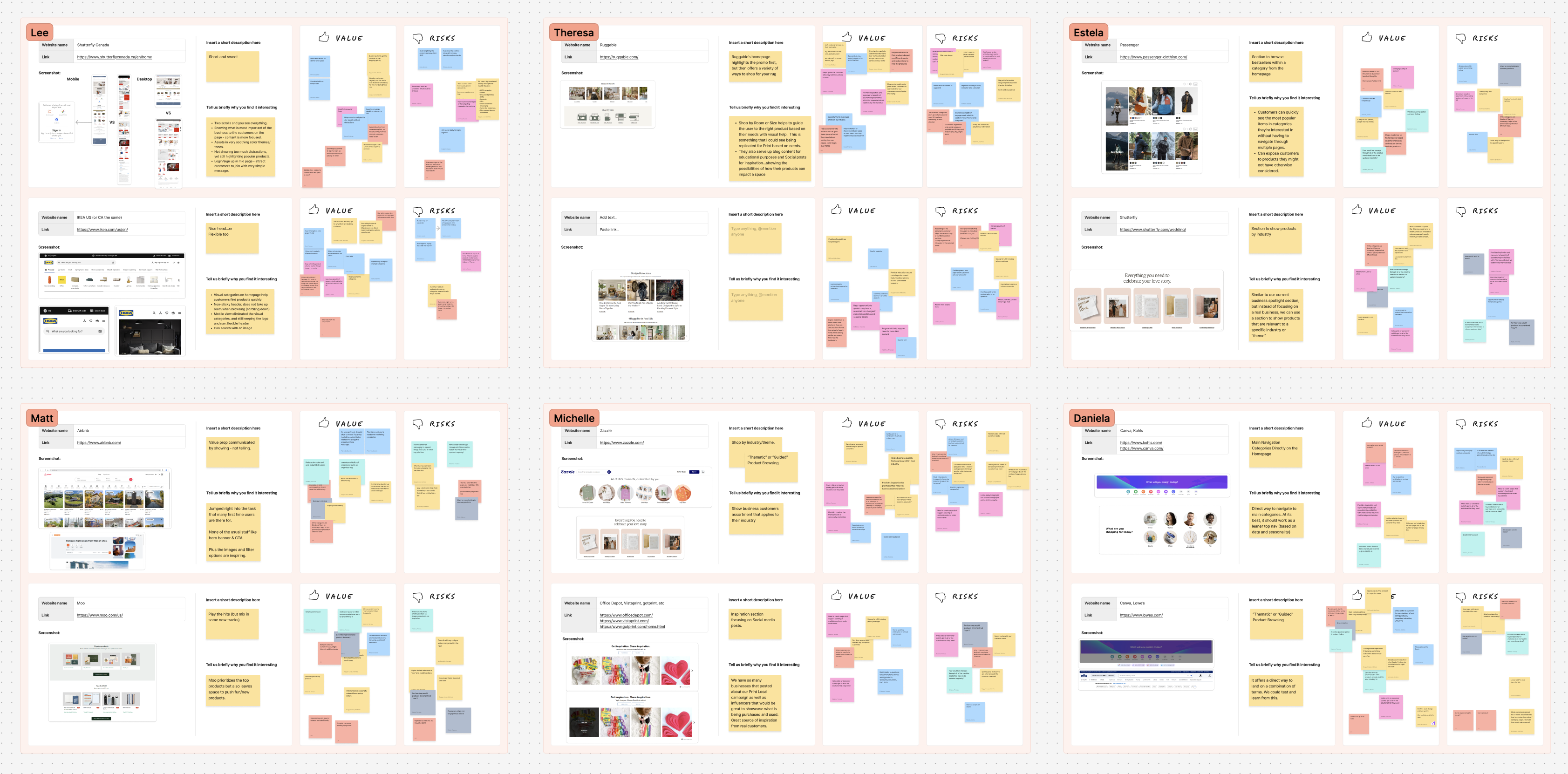
To ensure the redesign met both business goals and technical constraints, I initiated the project with a "Lightning Demos" workshop involving stakeholders from Development and Marketing.
Screenshot of lightning demos workshop in FigJam
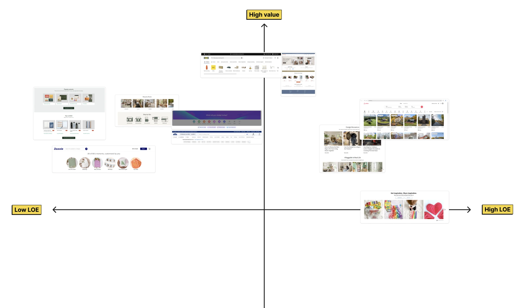
We analyzed competitor patterns to identify high-value content modules, which allowed Marketing to voice their needs while enabling Engineering to provide preliminary Level of Effort (LOE) estimates.
This upfront alignment allowed us to prioritize features based on ROI and technical reality, rather than subjective preference.
Screenshot of Competitors Analysys
Screenshot of Value vs LOE matrix
01
Pattern analysis
Auditing 20+ competitor sites to identify content patterns
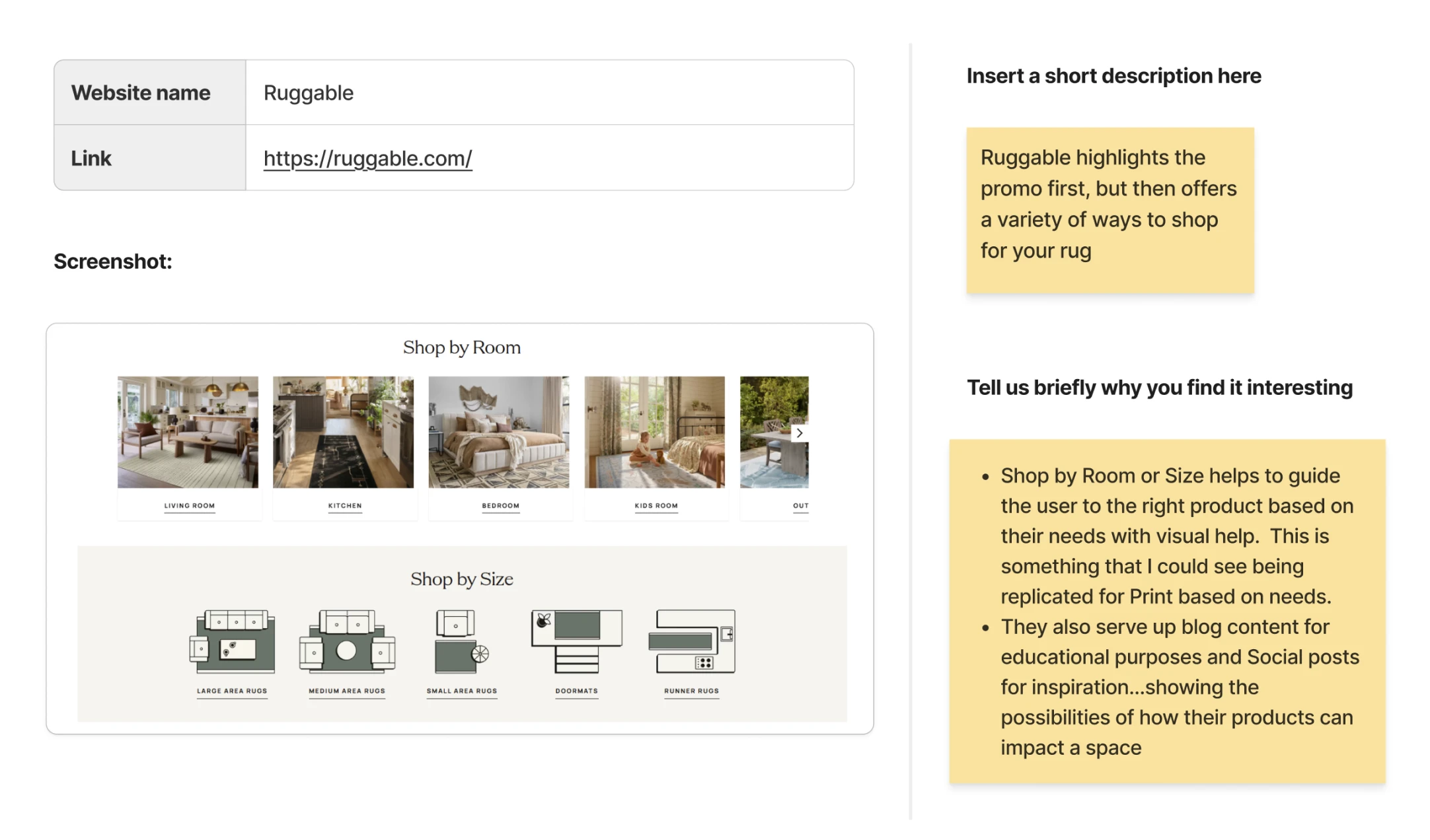
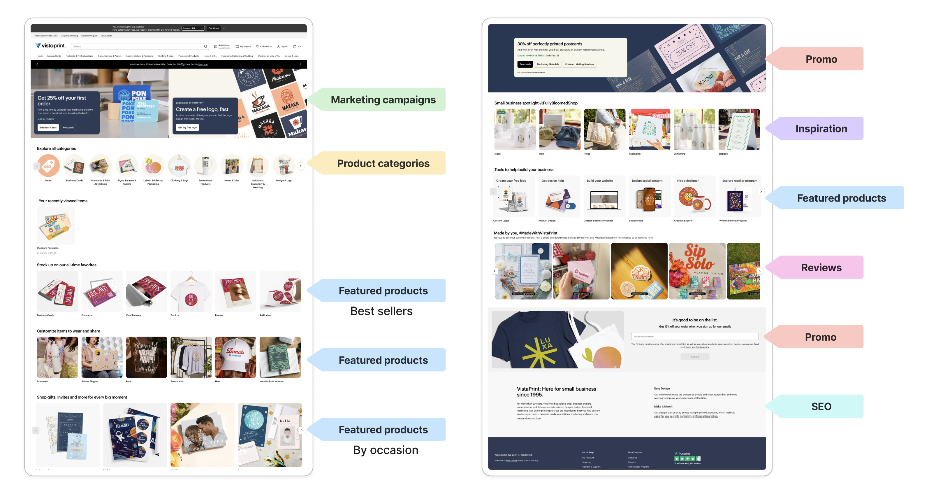
To move beyond subjective opinions on page layout, I conducted a rigorous competitive audit of 20 e-commerce websites. I dissected their landing pages to identify common patterns in how they prioritized information for the customer.
This analysis revealed 10 common content types.
Promos
Value proposition
Marketing campaigns
Featured products
Inspiration
Reviews
SEO
Product categories
Example of content analysis
02
Content Architecture
Restructuring information hierarchy to help customers
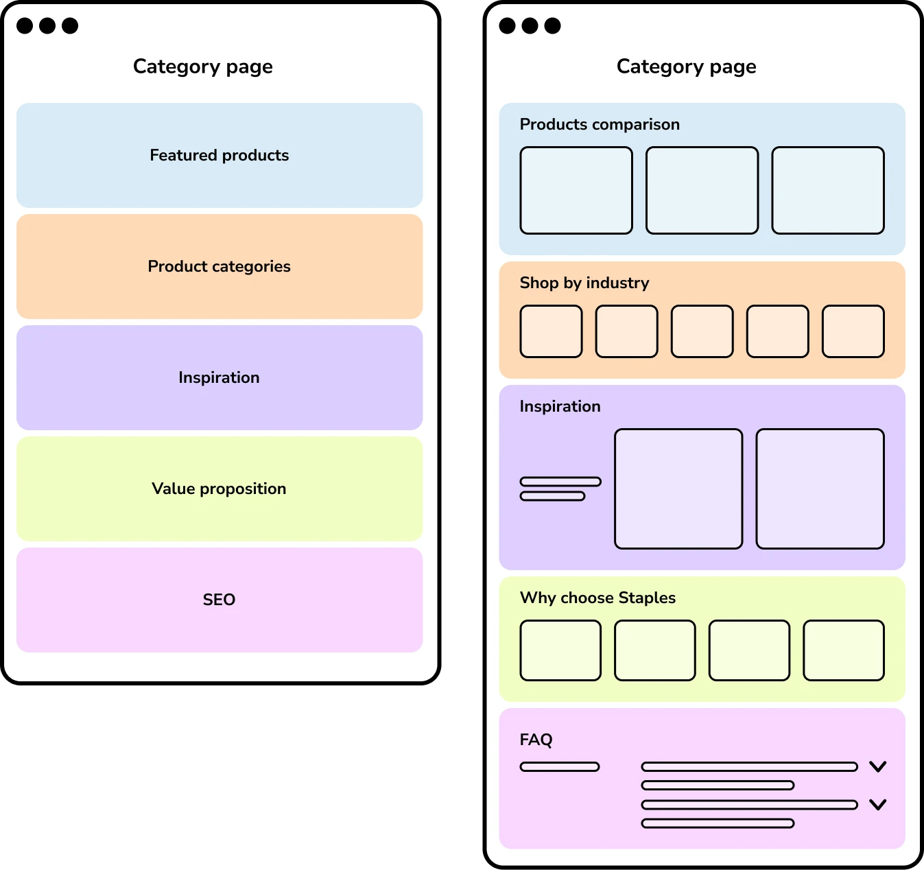
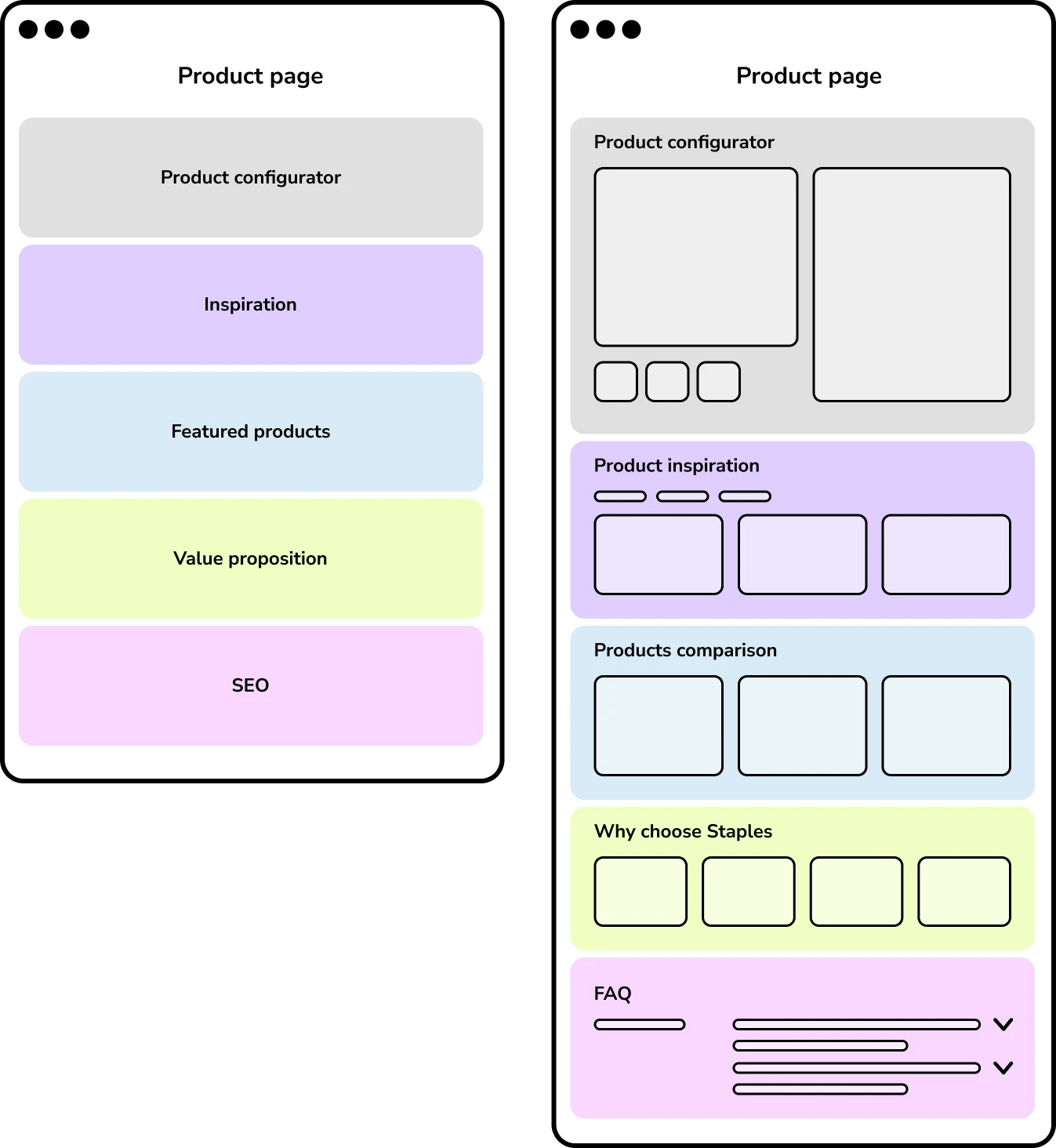
I created low-fidelity wireframes to focus on content priority and hierarchy. These low-fi artifacts were critical tools for negotiating content placement with stakeholders and validating the logic with development before any pixels were polished.
03
Component foundation
Establishing a "Dual UI Library" system to decouple exploration from documentation.
Given the number of components required for the redesign and the need for long-term CMS integration, I recognized that jumping straight into design would create unmanageable technical debt.
I prioritized a strategic planning phase, interviewing developers and designers to audit the friction points in our existing library while researching design system best practices.
This analysis revealed the need to decouple creative exploration from technical documentation. Consequently, I proposed a Dual UI Library System in Figma to serve as the scalable foundation for this project and future site updates.
Designers library
Includes live, publishable components that can be connected to active projects. It ensures the design team always use the most up to date, CMS assets.
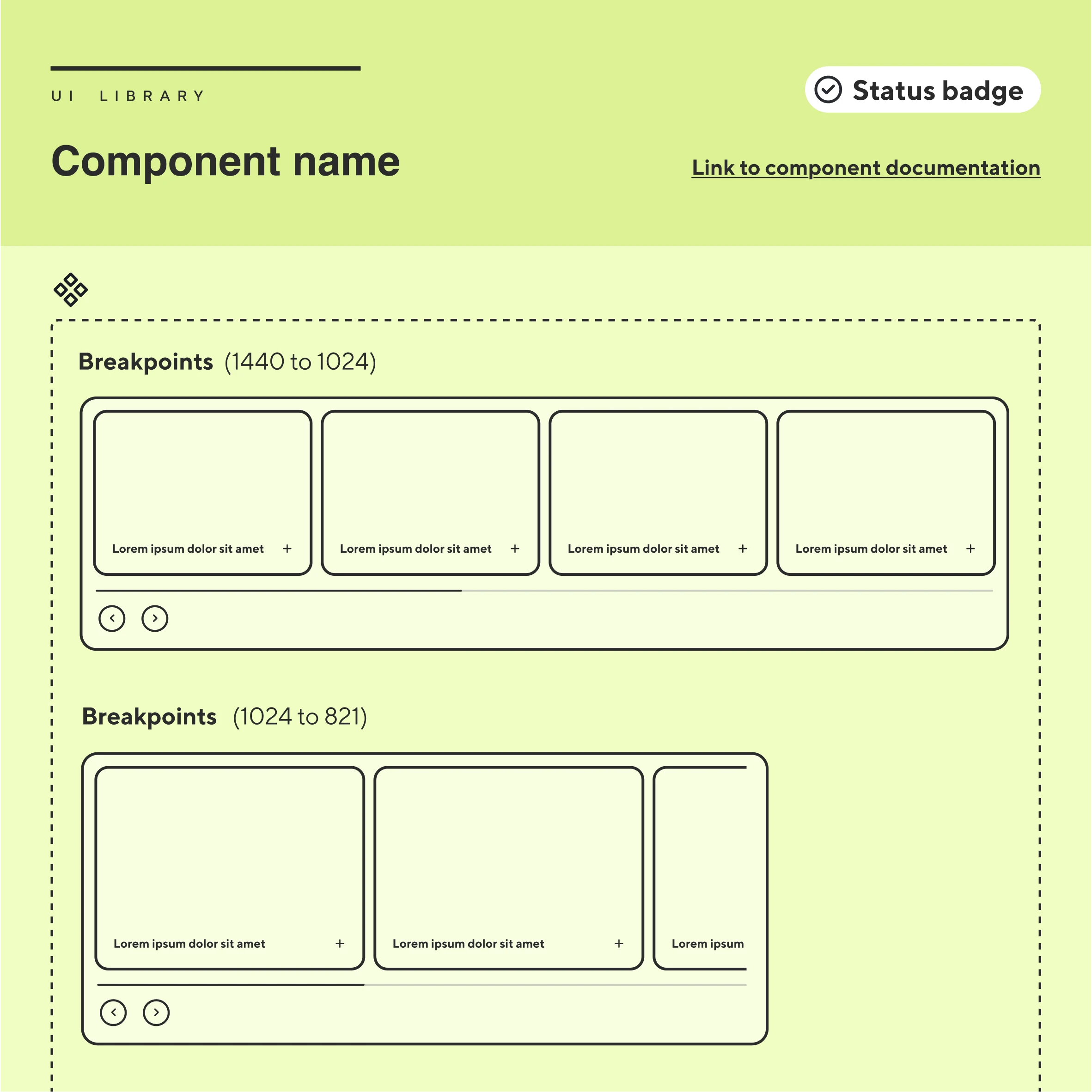
Specs Library
Provides developers with clarity and empowers designers to evaluate if an existing component fits new project goals or if a new solution is required.
04
Standardizing Governance
Founding the process to manage component delivery.
After the dual UI library was approved, I formalized a shared Figma workflow to manage a component rollout of 6 months, enabling me to lead the project while effectively splitting execution with a second designer.
IDEATION PHASE
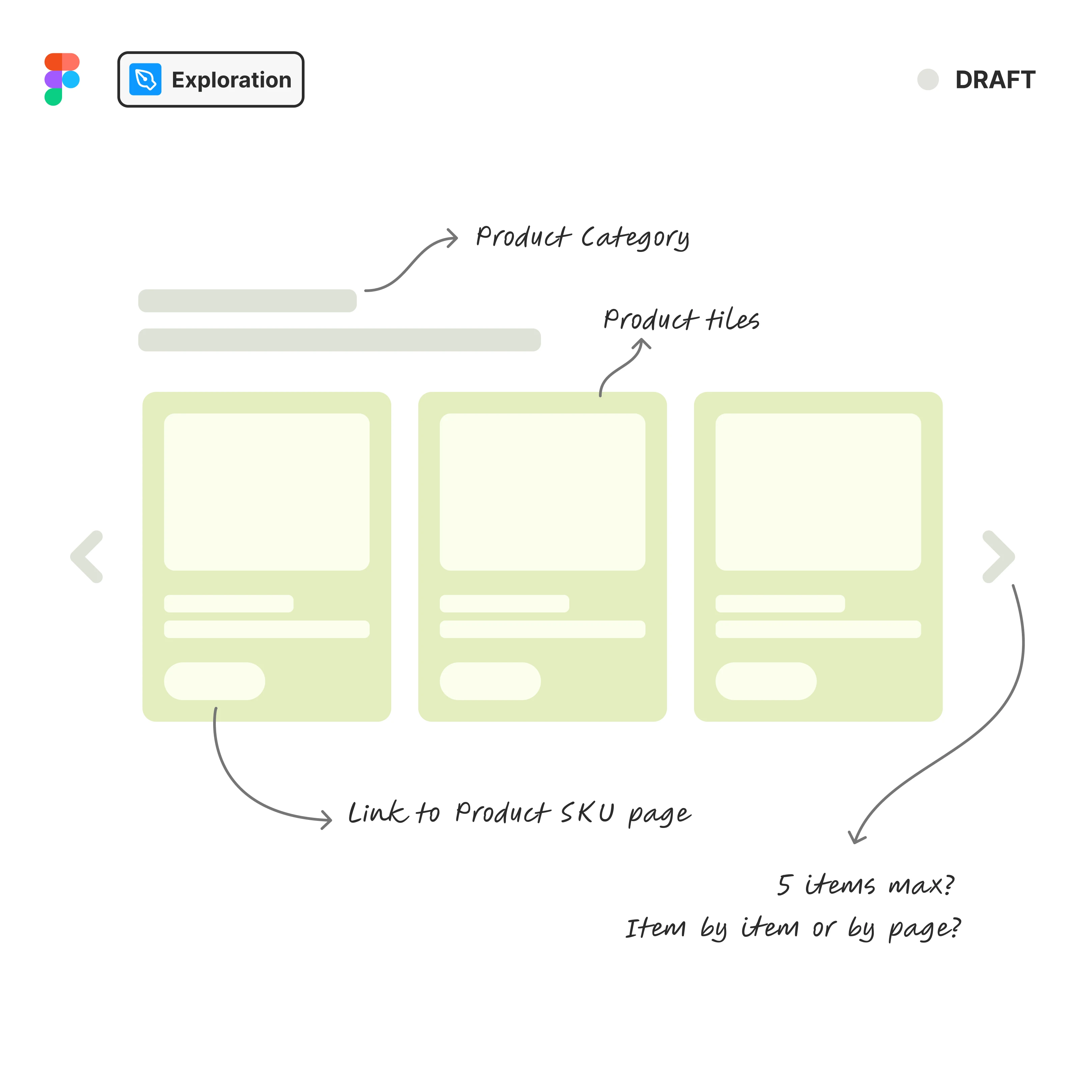
The Playground
Designers use the Exploration File to brainstorm, prototype quickly, and validate early designs with stakeholders.
Wireframes & prototypes
Low-fidelity to focus on content and testing.
Figma components
Unpolished versions focused on concept.
Stakeholder feedback
Early alignment and design approval.
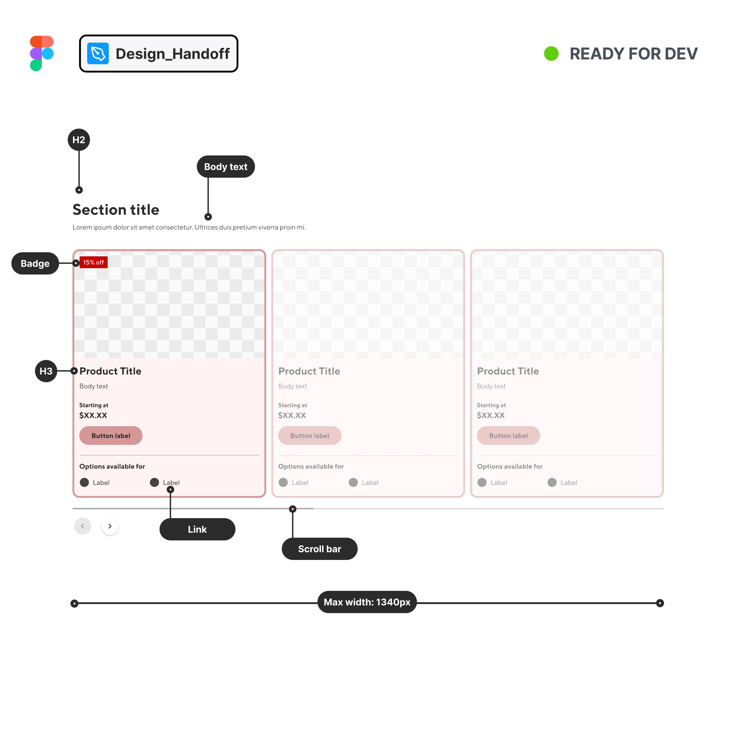
DESING HANDOFF
The Documentation
Designers translate approved concepts into high-fidelity specifications, ensuring a seamless transition to engineering.
High-fidelity Mockups
Desktop, tablet, mobile.
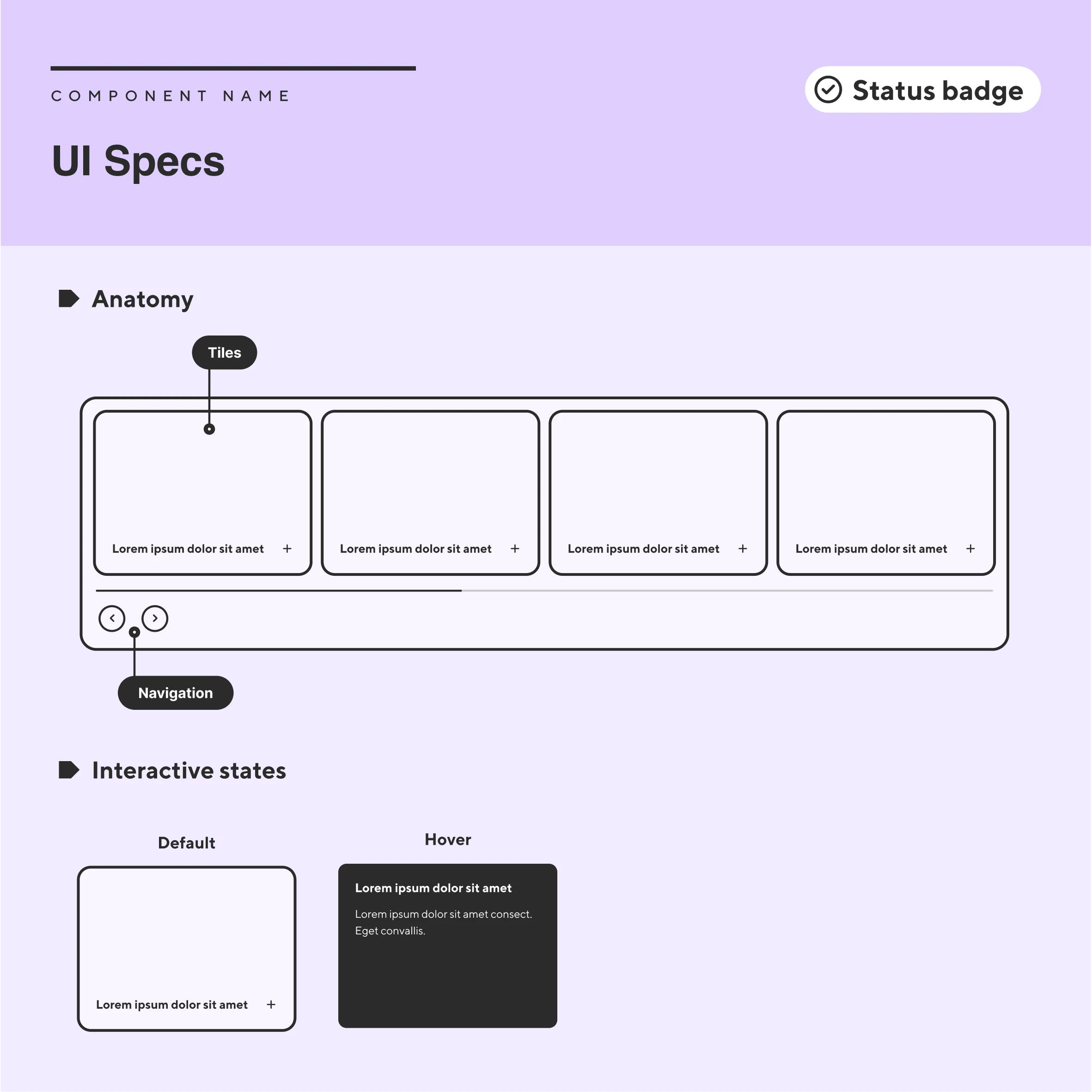
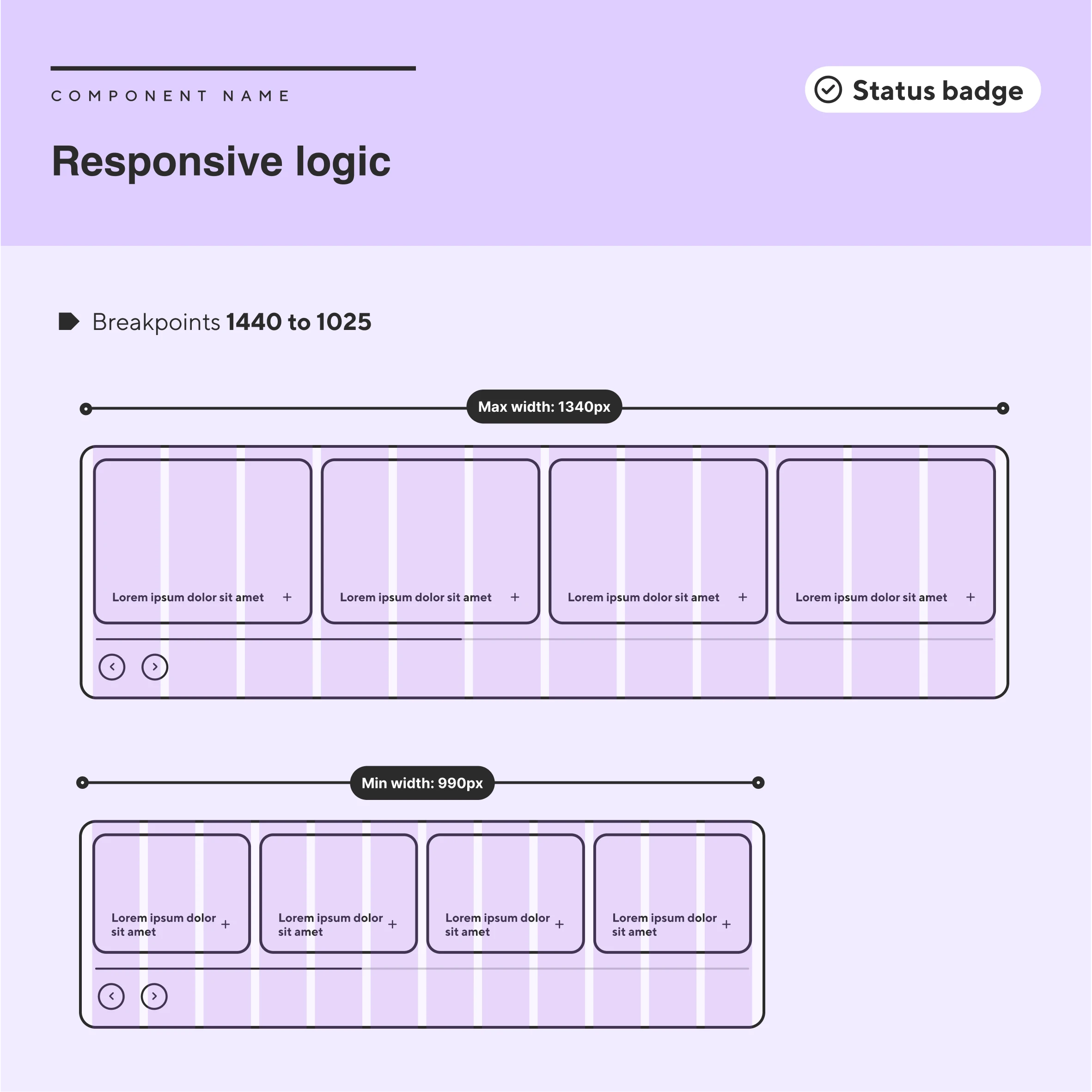
UI Specs
Anatomy, variants and interactive specs.
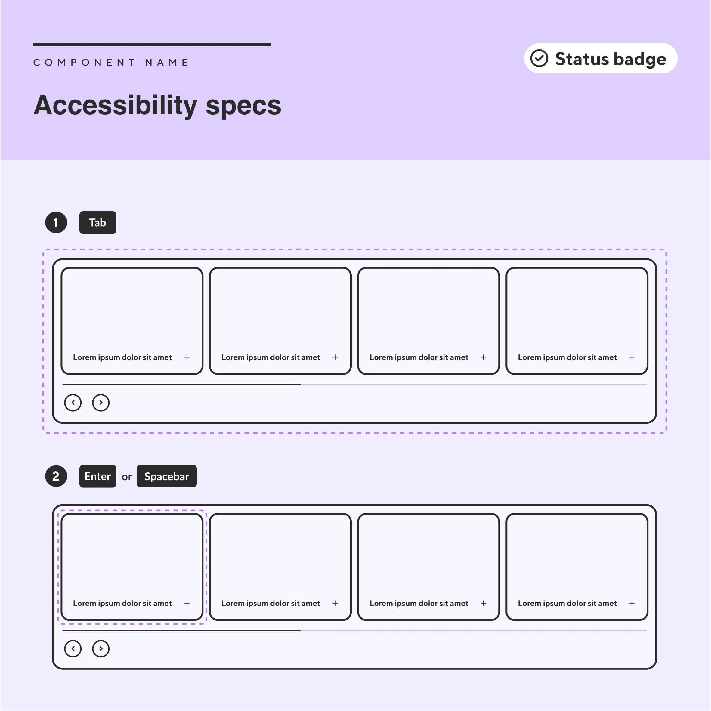
Accessibility specs
Keyboard navigation and aria labels.
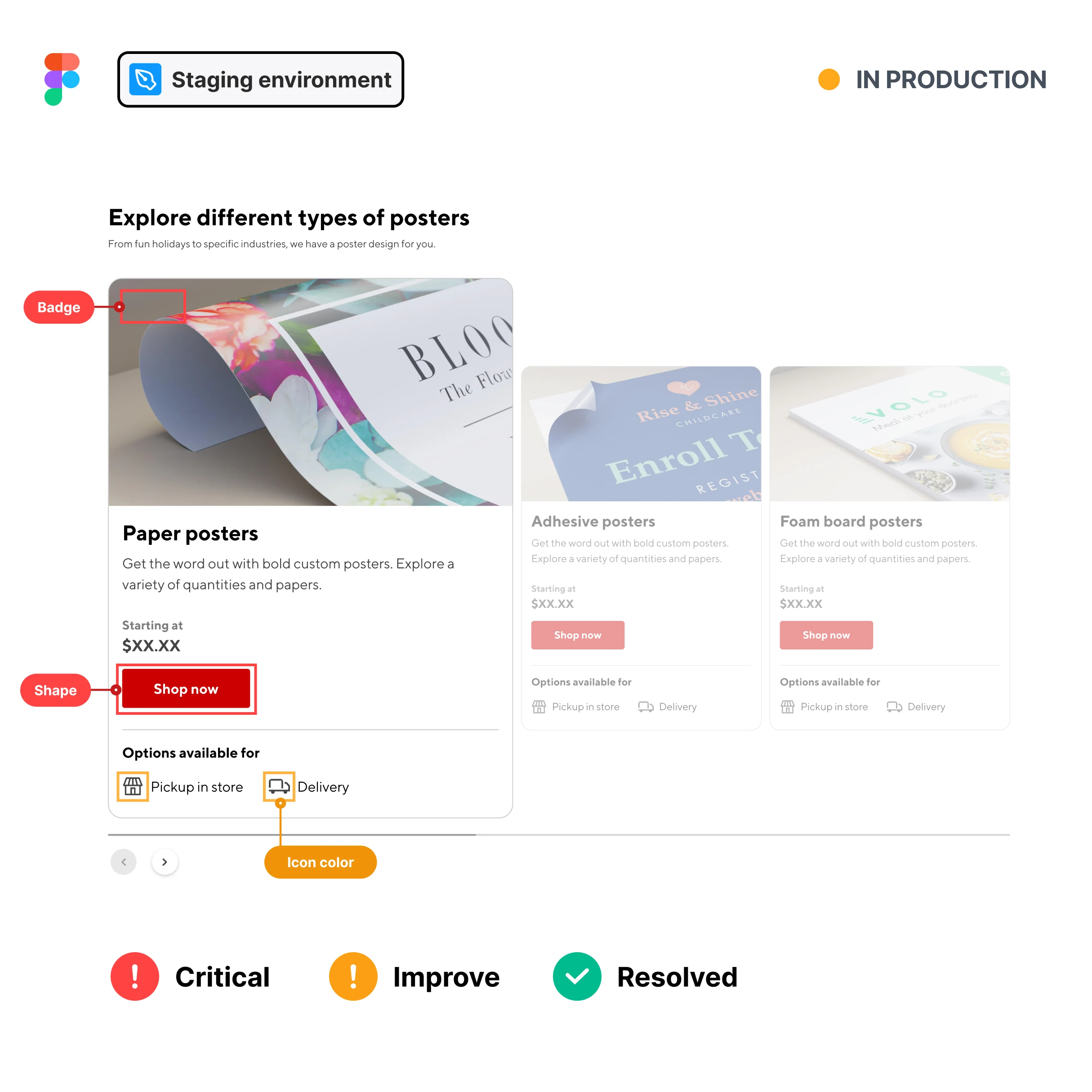
IMPLEMENTATION
The Build
During development, designers stay involved to provide support to the engineering team and ensure the vision looks and works as intended.
Staging UI Review
Checks on real data & device environments.
Traffic Light System
Prioritizing critical vs cosmetic fixes.
Dev Support
Clarifying questions and edge cases.
POST-RELEASE
The Libraries
The component is cleaned up, documented as a source of truth, and synced to the dual library ecosystem for future reuse.
Sync UI Library
Adding the Figma component to the designers library.
Production Specs
Renaming and moving handoff files to the documentation library.
The component is cleaned up, documented as a source of truth, and synced to the dual library ecosystem for future reuse.
Sync UI Library
Adding the Figma component to the designers library.
Production Specs
Renaming and moving handoff files to the documentation library.
Archive exploration
Cleaning up the playground for organization.
06
Scalable Implementation
Launching the components and new library system
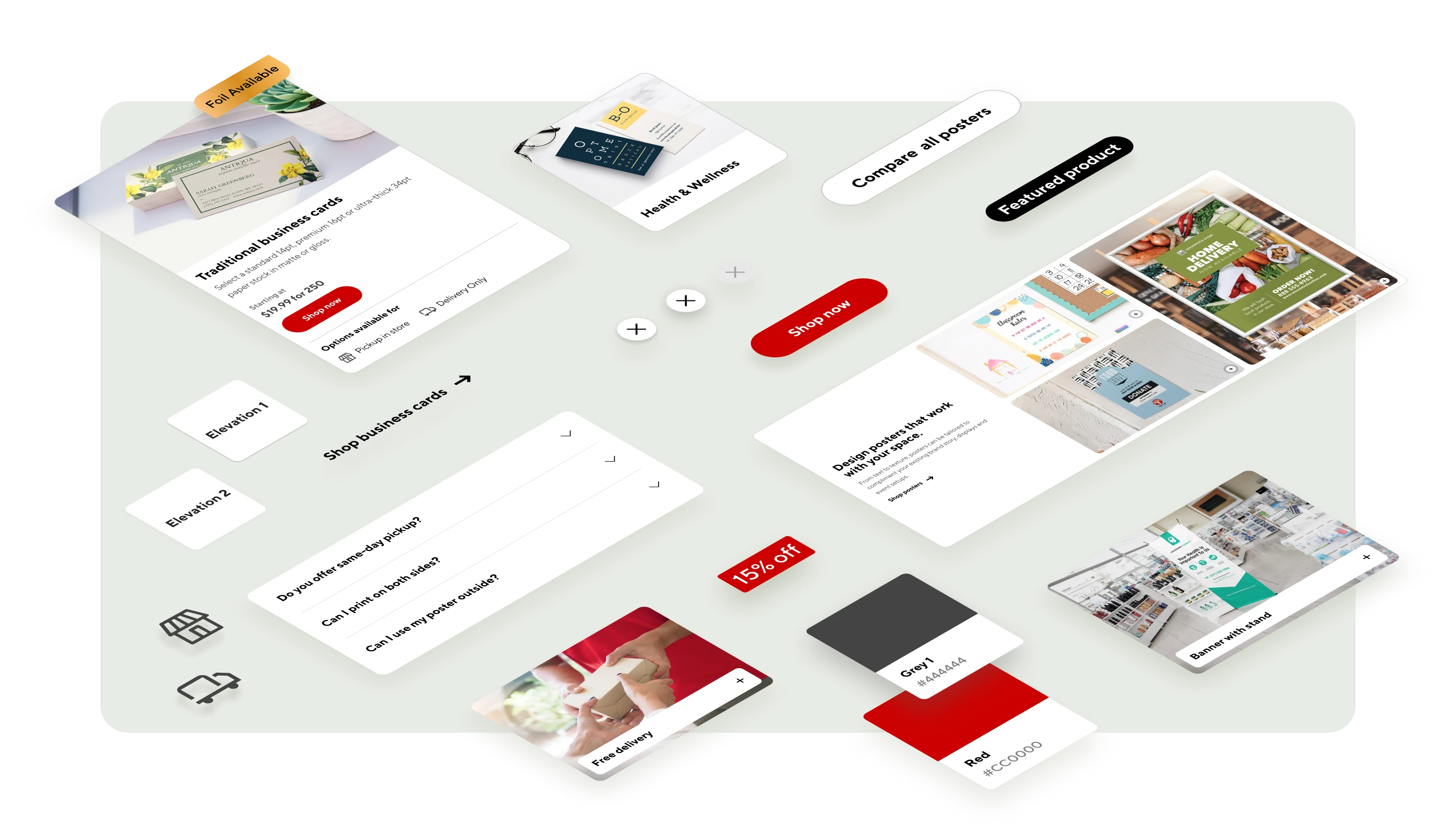
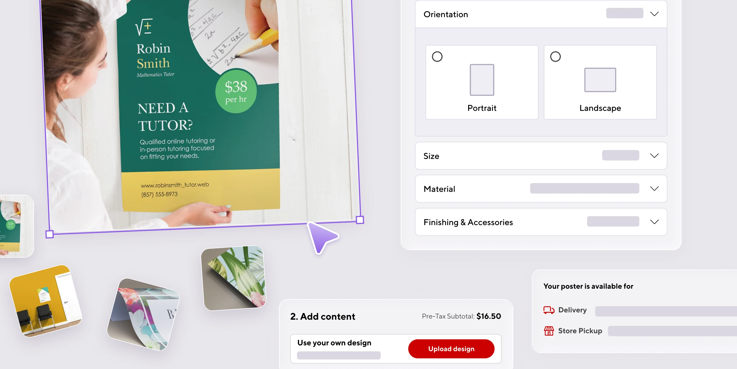
I led the implementation of the new Posters category page as the primary pilot for our updated workflow. By utilizing the Designers UI Library and Web Specs, we successfully transitioned from a fragmented legacy experience to a modular, high-performing interface. This rollout served as the "proof of concept" for the dual-library architecture.
Before
Rigid structure that lacks visual hierarchy and is difficult to update.
After
Modular system where every section is a reusable component.
Component - 1
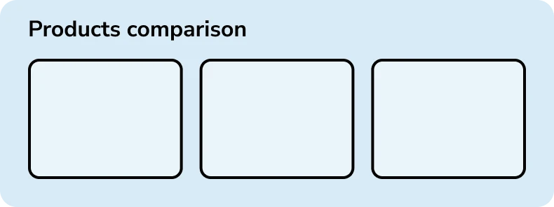
Product comparison
Component - 2
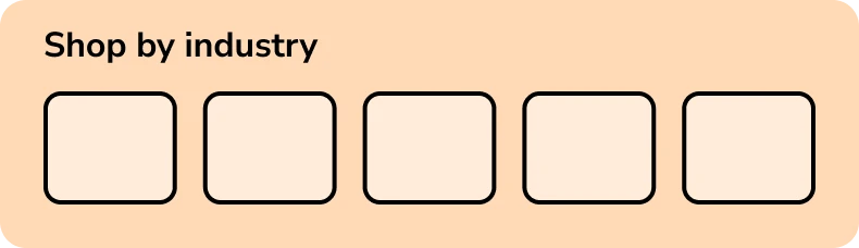
Shop by industry
Component - 3
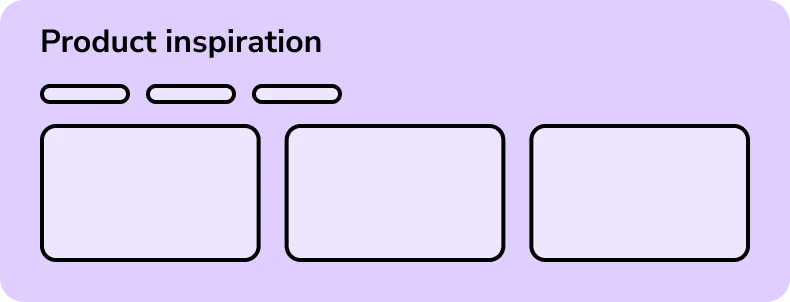
Product Inspiration, variant with 3 images
Component - 3
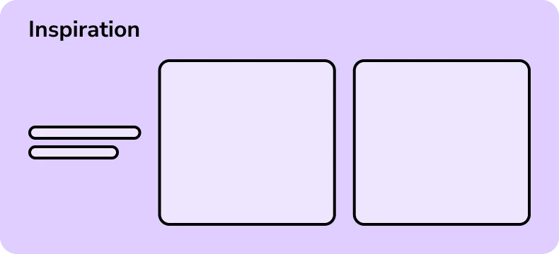
Product Inspiration, variant with 2 images
Component - 3
Product Inspiration, variant with 1 image
Component - 4
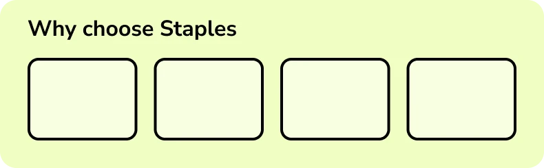
Value props
Component - 5
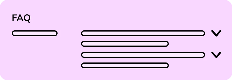
Frequently asked questions
07
The Impact
Systemic ROI
Designing for maximum reuse accelerated the time to market by 40% for subsequent product category launches. The new modular approach improved the customer experience across all future rollouts while reducing long term design and development effort.
Flexible toolkit
The new system provided the foundational elements that now allow designers to deconstruct and reassemble components for any new business need, ensuring that every future project inherits the correct visual DNA and interaction logic.
Marketing self-serve
Marketing stakeholders are now empowered to update content via the CMS. By using the modular system, they can launch seasonal campaigns in days rather than weeks, without requiring new design resources.
Development efficiency
The Specs Library eliminated technical ambiguity, allowing developers to build faster with zero documentation drift. Which reduced design related JIRA tickets by 32% including development support and UI fixes.
More Projects
Bridging the gap between digital and printed results