✦ ABOUT THE PROJECT
Bridging the gap between digital and printed results
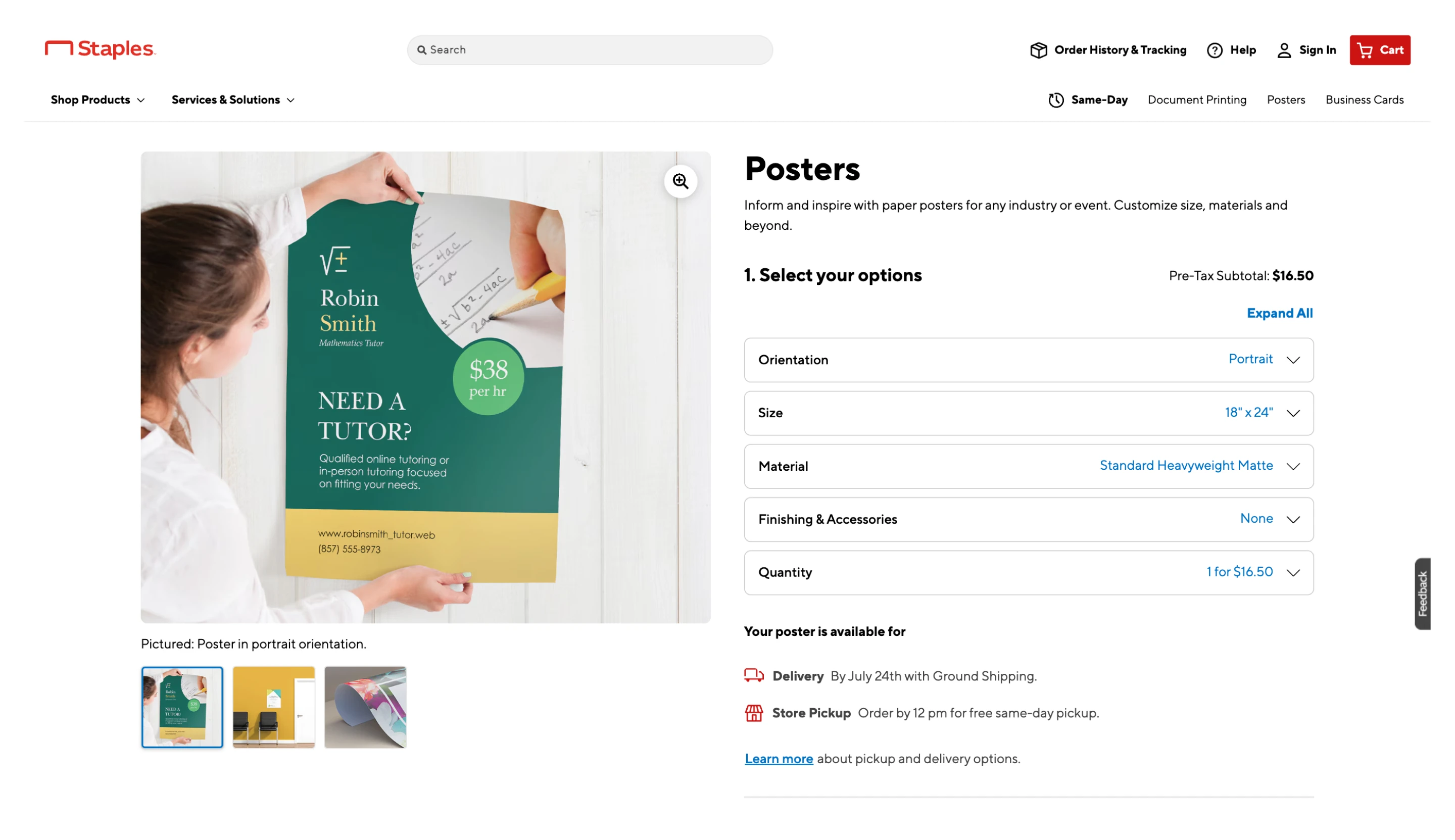
The goal of this project was to improve user confidence in the online product customization process. I achieved this by executing a holistic redesign of the user flow, specifically focusing on clarifying and enhancing the presentation of critical customization options.
The resulting solution successfully increased user trust and improved conversion, while also establishing a scalable foundation of a reusable component library for future product pages.
ROLE
Sr. Product Designer
Category
E-commerce
timeframe
1.5 months
01
The assurance void
Uncovering the main pain points
A comprehensive UX audit to identify the roots of a low NPS (Net Promoter Score), pinpointed that many customers were having issues with the post-editor upsell page. This page was creating a confidence deficit because crucial customization options lacked clarity, actively eroding user trust and hindering conversion.
Lack of descriptive text
Lack of supporting imagery
Lack of pricing transparency
Unclear material names
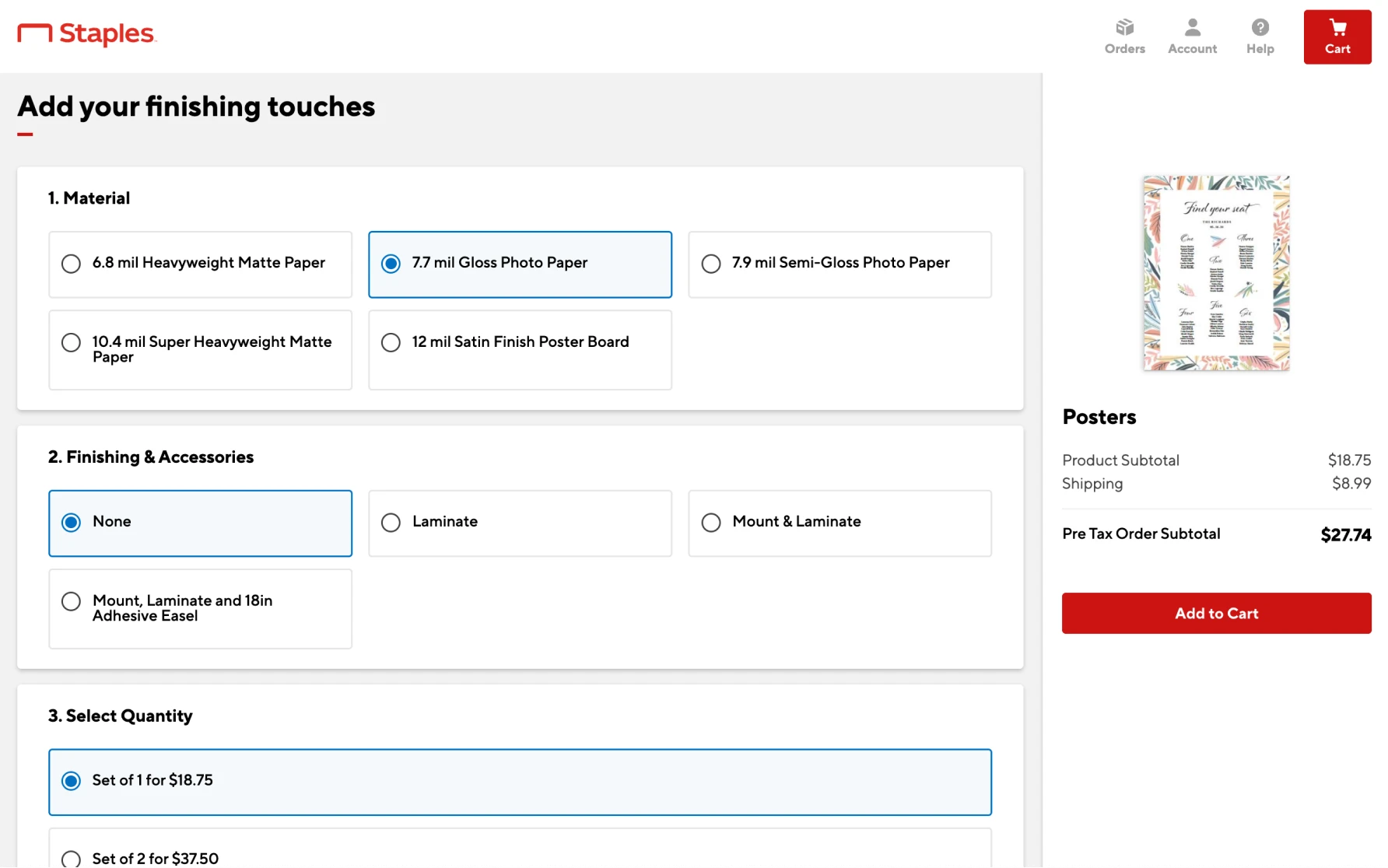
Screenshot of the upsell page
02
Shifting focus
Transitioning from upselling to the forefront
As a first step, the Product Manager and I identified a key opportunity to boost customer satisfaction by strategically moving key customization options (materials, finishings, and accessories) from the pre-checkout upsell page to the product landing page. This shift would simplify the purchasing journey and ensure pricing clarity.
Old Flow
Product SKU
Customization
Approval
Upsell
- Materials
- Finishing
- Accessories
Cart
New Flow
Product SKU
- Materials
- Finishing
- Accessories
Customization
Approval
-
Cart
03
User insights
Conducting user interviews to refine imagery and messaging
To define the most effective content and layout for the new product page, I conducted ten customer interviews focused on a direct content comparison between our platform and competitors. By observing how users processed product imagery and descriptions, I gathered crucial qualitative insights that would support the decision-making needs of new and experienced customers.


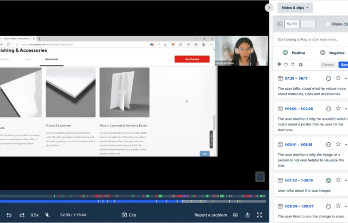

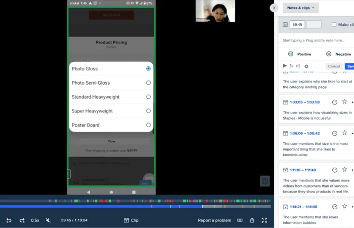

Screenshots of user interviews on usertesting.com

Screenshot of user interview on usertesting.com
This is confusing, is basic going to make my poster look cheap?
I feel like I'm picking the wrong choice.
I liked that when I changed the coating to glossy,
the preview instantly showed the shine.
I know what I want. I don't need to read about the poster,
I just need to start selecting options.
Just tell me, 'For this use, we recommend this option' or
maybe show me what the most popular choice is.
The description for 'Tear-Resistant Vinyl' explicitly said
'Recommended for outdoor use.' That was helpful.
04
Exploring solutions
Defining a scalable interaction model to craft the experience
Leveraging insights from customer interviews and competitive analysis, I explored various interaction models to structure the configurator. This phase required a careful balance between user needs and strict business logic, all while keeping the architecture flexible enough for future products.
Non-linear customization
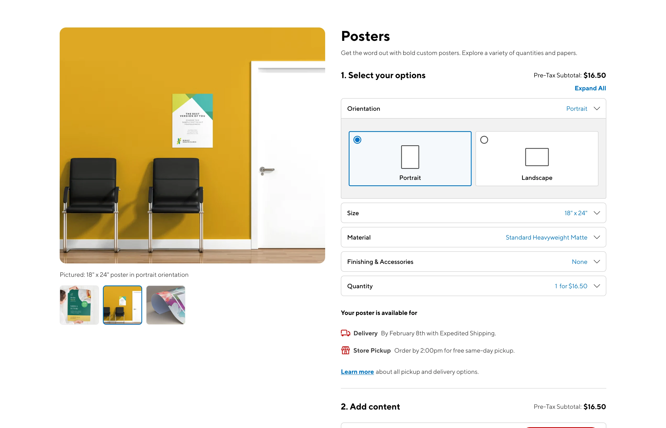
Replaced sequential steps with, non-linear control drawers, allowing users to directly jump to and modify any customization category, maximizing efficiency and perceived control.
Visual decision support
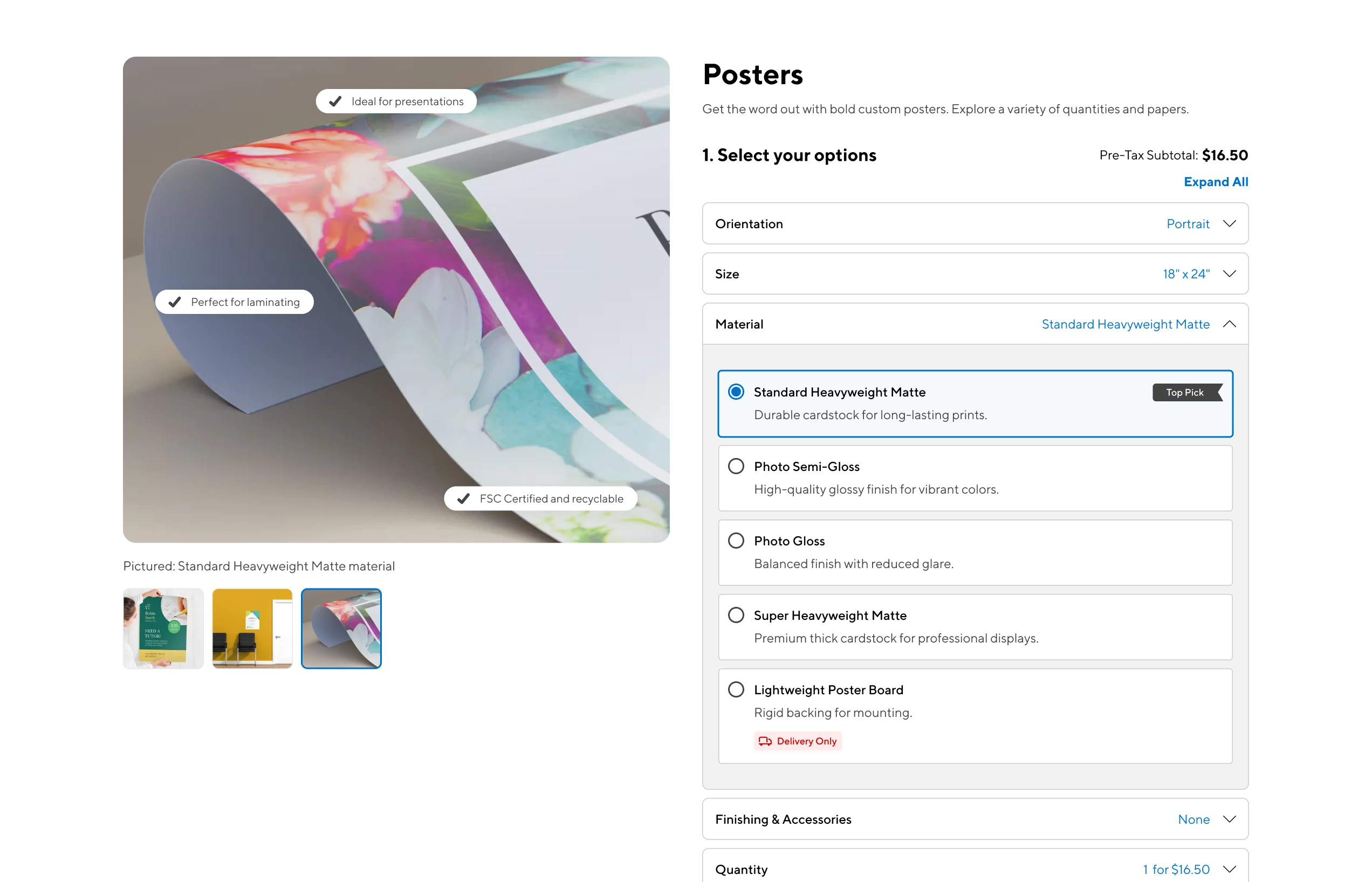
Integrated image-based previews for every selection, empowering customers to visually build their product and eliminating guesswork about the final appearance.
Contextual clarity
Enhanced the understanding of complex materials and finishes by adding descriptive text to radio buttons and utilizing key visual callouts on images.
05
Seeking feedback
Prototyping to communicate and test design ideas.
Throughout the iterative process, the prototype was my key communication tool. It helped me effectively convey design decisions to stakeholders for feasibility checks and scoping. I also used it for usability testing to gather user feedback.
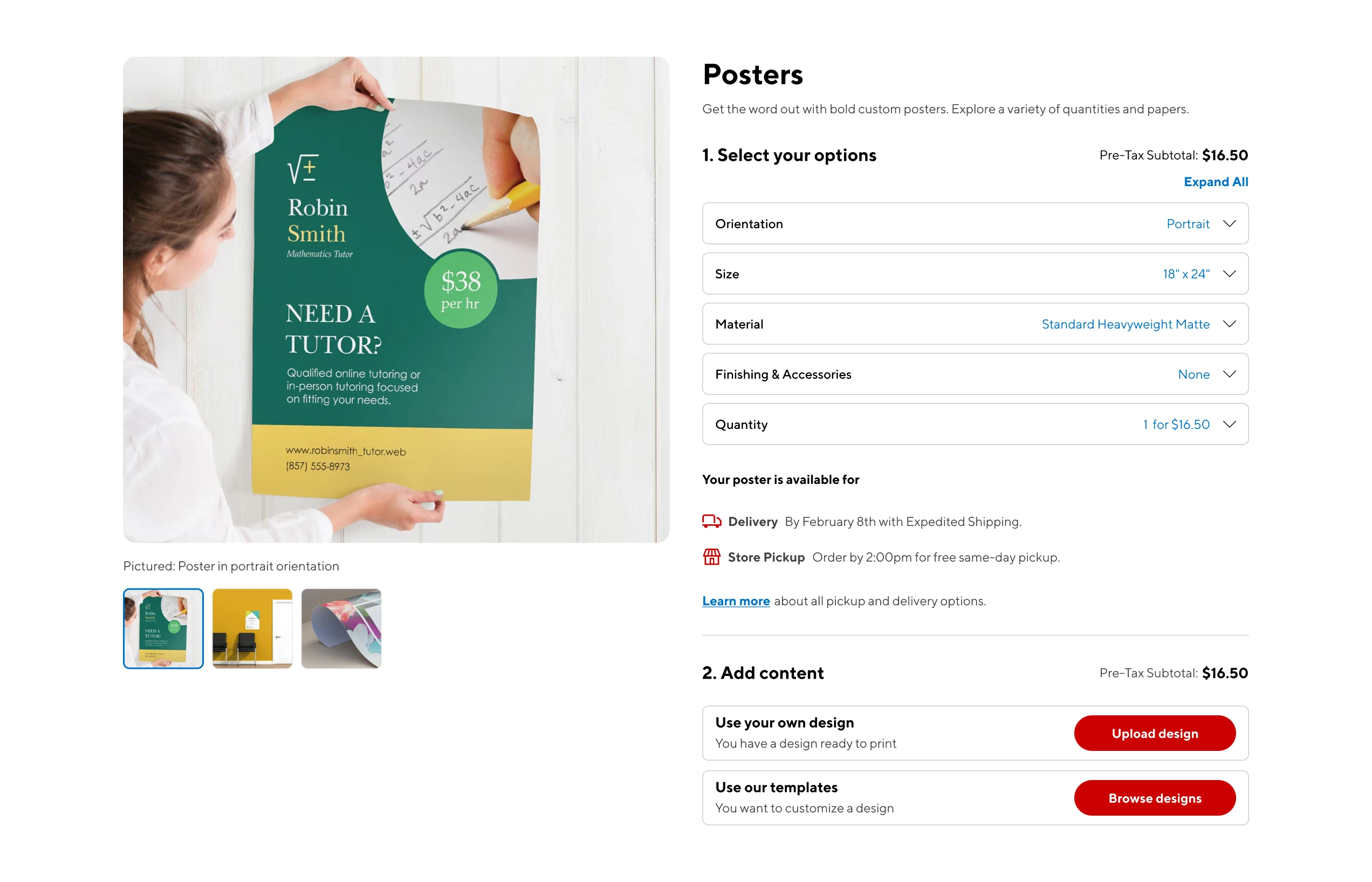
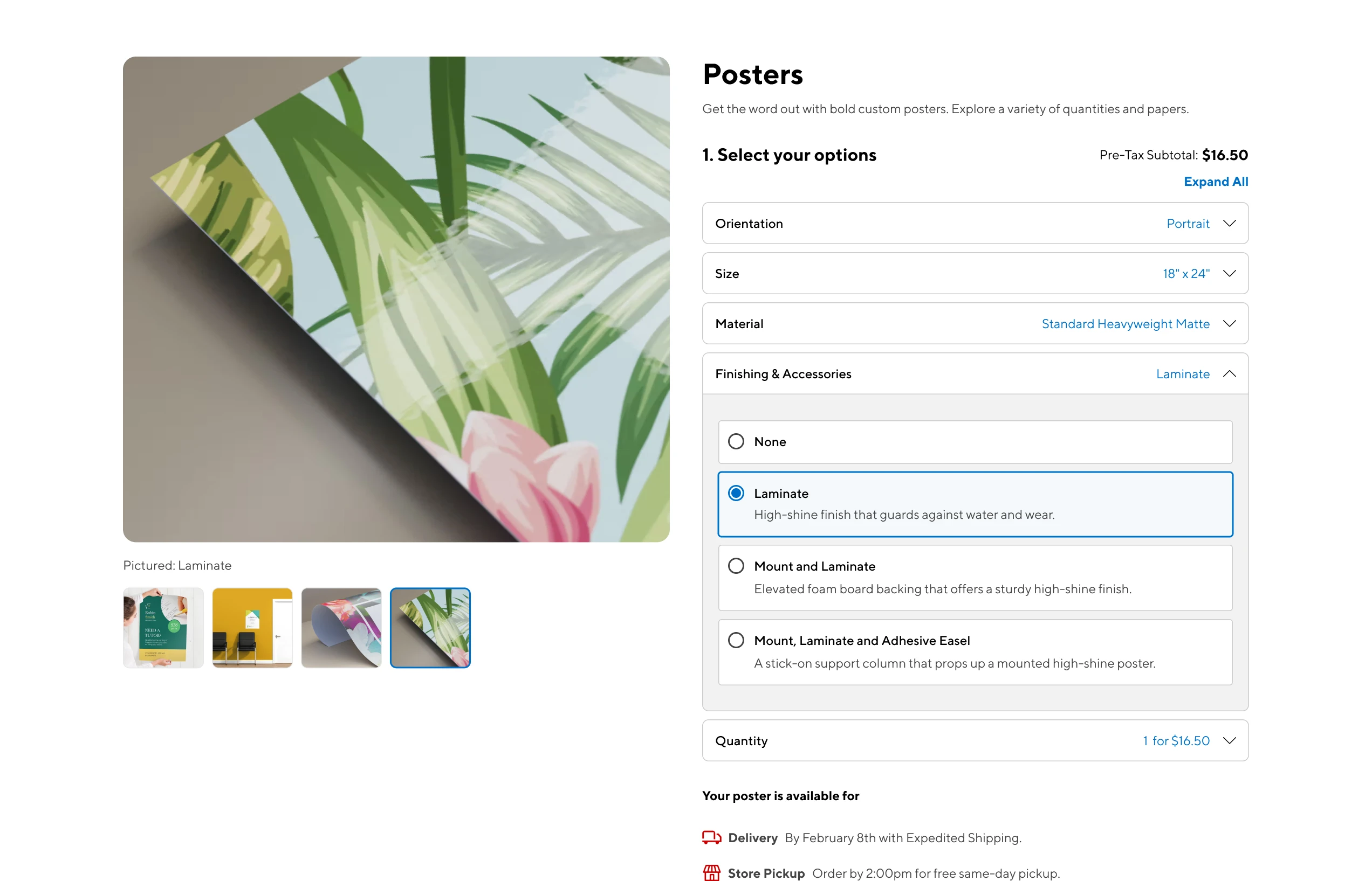
Selecting any option instantly triggers dynamic updates to the image gallery and caption. This logic validated complex front-end requirements early.
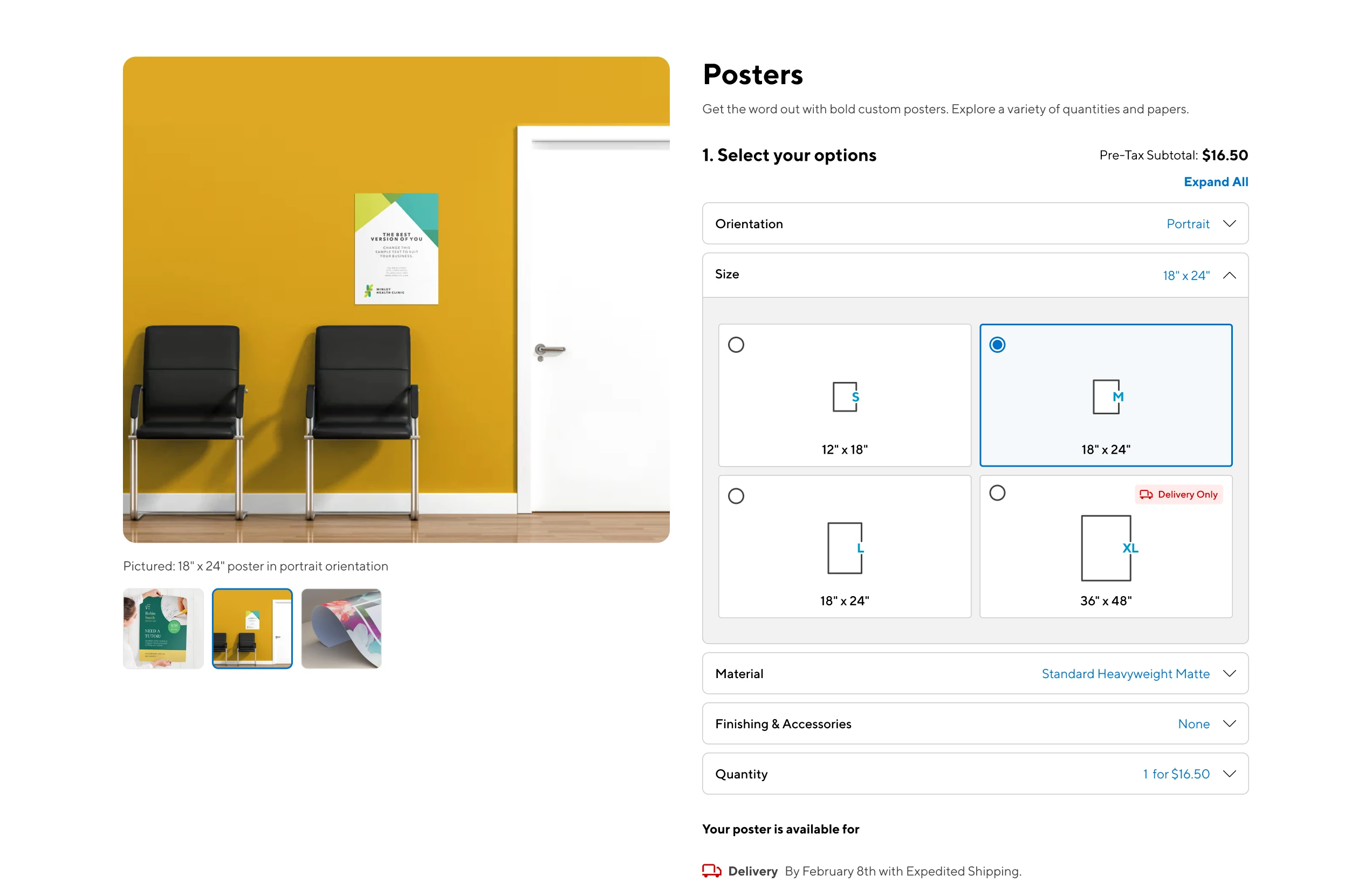
Incompatible options are disabled and include a clear explanation to guide users away from invalid configurations.
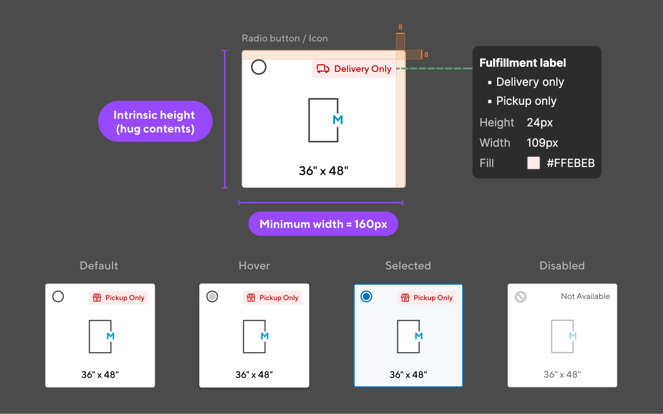
Selecting a 'Delivery Only' option automatically removes 'Store Pickup' from fulfillment availability, aligning the interface with logistics rules.
Gathering feedback from users
Through testing, I systematically gathered user feedback on crucial areas to user confidence and task completion. This direct user engagement ensured that interactions were intuitive and validated key design decisions before committing to development.

Layout
Users found the organization of options into collapsible sections intuitive, making the overall interface easy to scan and preventing cognitive overload.

Fulfillment
Users expressed a desire for earlier communication of delivery costs and lead times, stating that knowing only the fulfillment method was insufficient.

Images
The sticky gallery functionality was highly praised for maintaining visual context.

Pricing
Users valued having the price integrated directly within the quantity options, facilitating faster purchasing decisions.

Navigation
Users expressed fatigue with repetitive clicking, indicating a strong need for a global control to view all available options simultaneously.

Interaction
Disabling incompatible options with explanatory text, was seen as a major factor in reducing user frustration.
06
Polishing the design
Refining the visual interface for a seamless user experience
The final design phase focused on high-fidelity visual refinement to ensure seamless integration with the existing ecosystem. Adhering to the Staples Style Guide, I applied the brand’s official typography, color palette, and component styling.
I also incorporated critical functionality based on user feedback, adding a global 'Expand All' link for better visibility and an informational lightbox to provide detailed delivery and pickup specifications without cluttering the interface.


Adapting the design for mobile screen sizes.
The mobile design strategy centered on eliminating the main image gallery to avoid continuous scrolling to view visual updates. This key decision drove all subsequent adjustments aimed at maintaining context and optimizing navigation on small vertical screens.
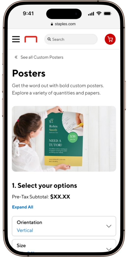
Kept a static cover image for immediate product context.
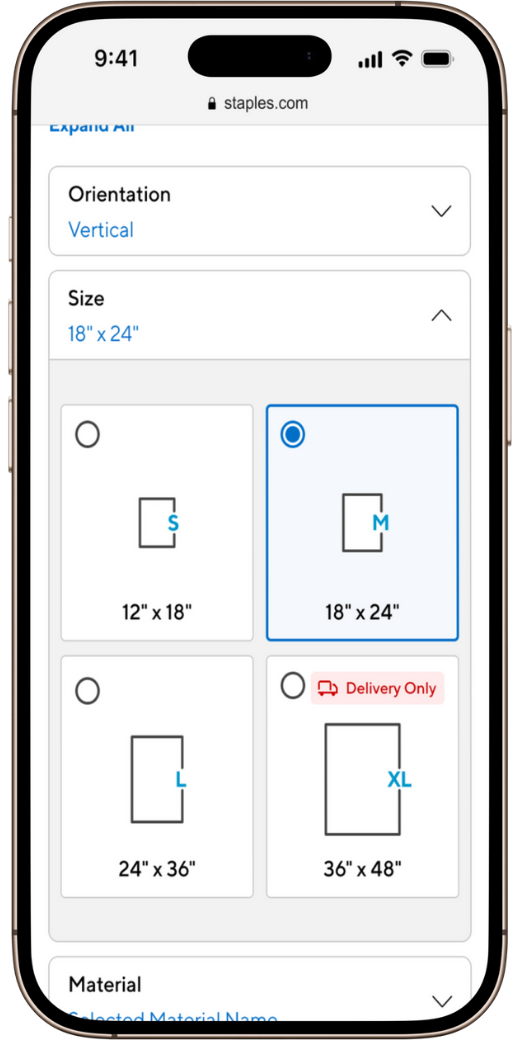
Retained orientation/size icons for visual reference.
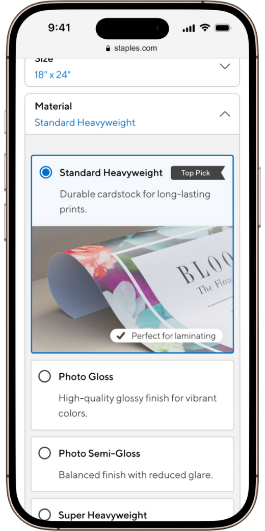
Embedded material/finishing images directly into options.
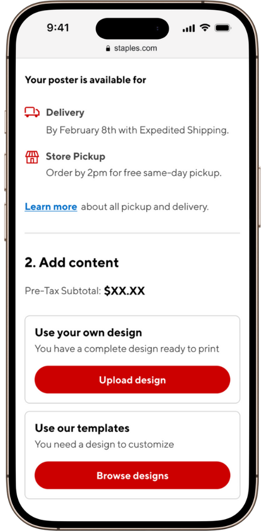
Optimized fulfillment and primary action buttons.
07
Empowering the team
Creating specifications to guide implementation
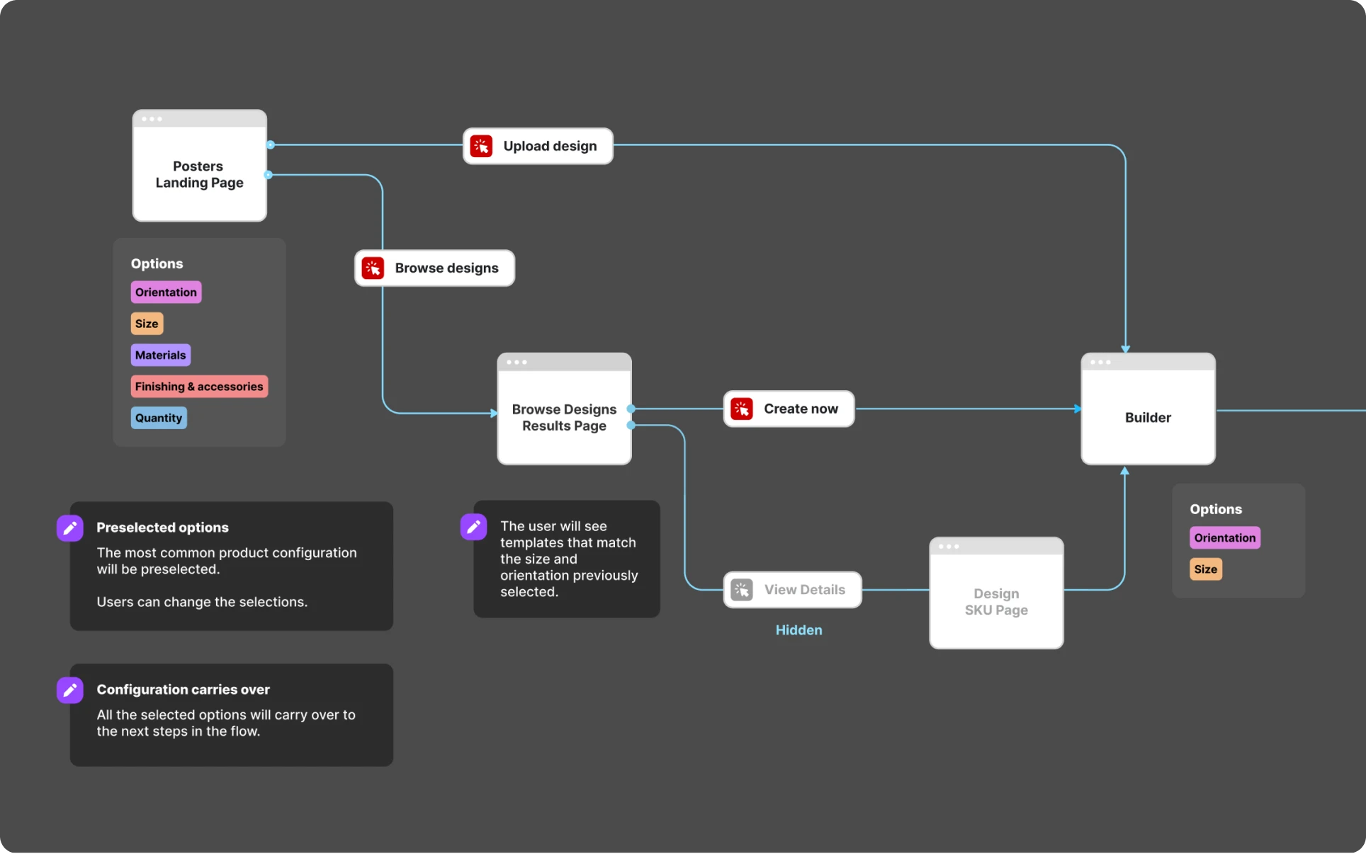
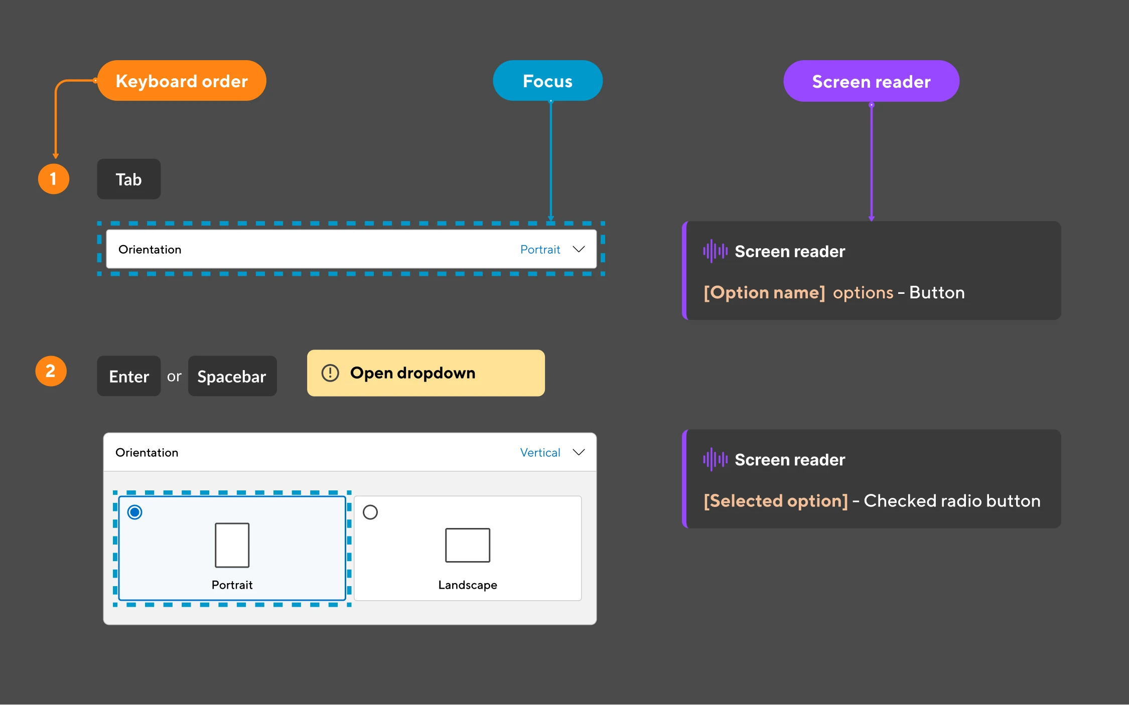
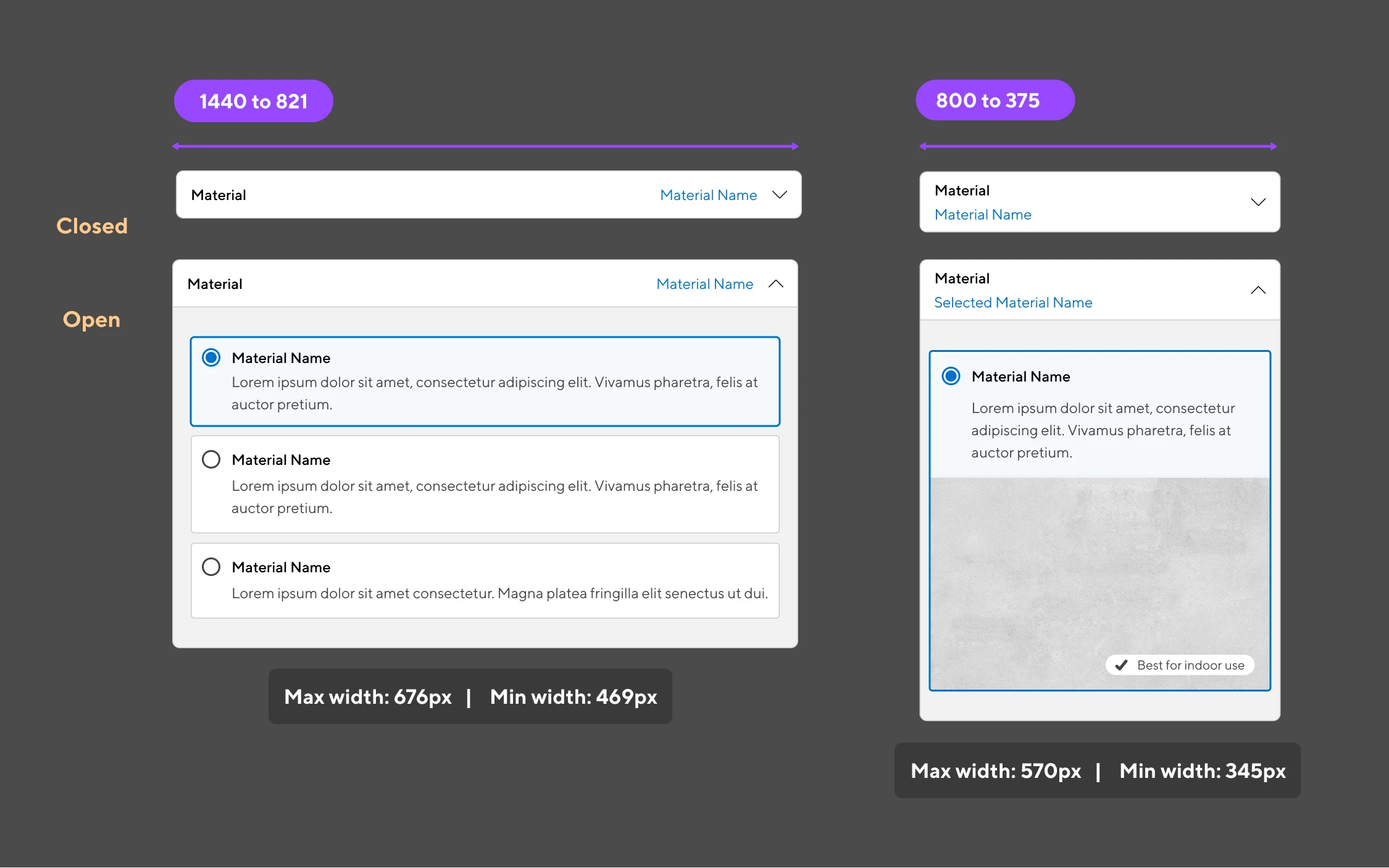
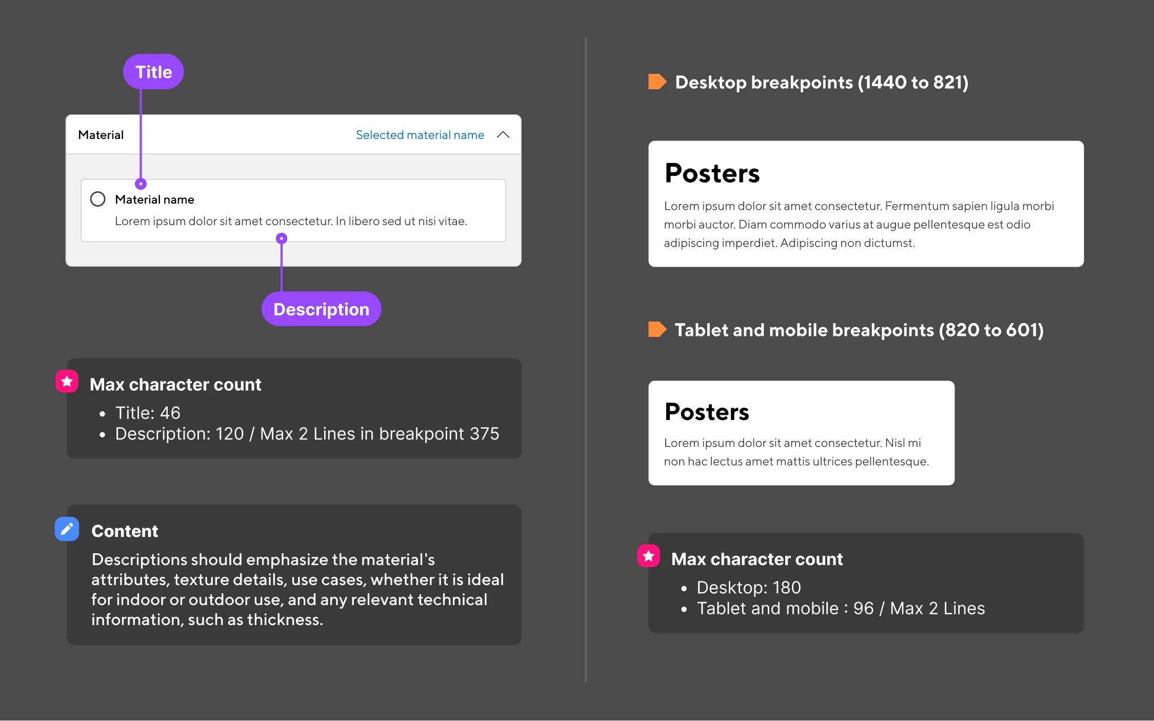
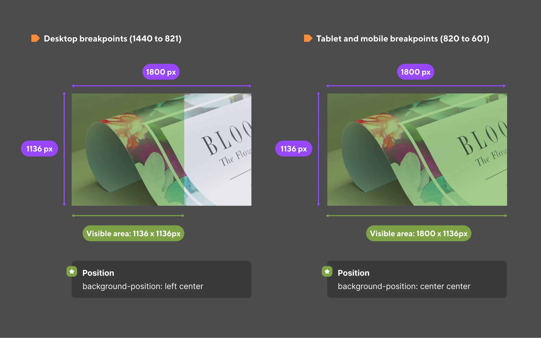
To ensure the final product matched the design intent, I prepared a comprehensive handoff package serving both Development and Marketing teams.
08
Results drive evolution
Quantifying the business impact
To ensure the final product matched the design intent, I prepared a comprehensive handoff package serving both Development and Marketing teams.


The team at Hub took our vision and turned it into a reality. Working with them has been a game-changer for our brand. Their creativity and professionalism are unmatched. We couldn't be happier with the results.
Pragm Envato User

The team at Hub took our vision and turned it into a reality. Working with them has been a game-changer for our brand. Their creativity and professionalism are unmatched. We couldn't be happier with the results.
Jack Envato User
Don’t hesitate to contact me. I'm just an email away.
Get in Touch
hello@estelaordonez.com
Project Offers
info@hub.com
Copyright © 2025 Estela Ordoñez. All Rights Reserved.
