From Fulfillment Friction to Checkout Confidence
I led a redesign of the Staples Print cart and checkout to support mixed fulfillment orders without adding complexity to the purchase flow.
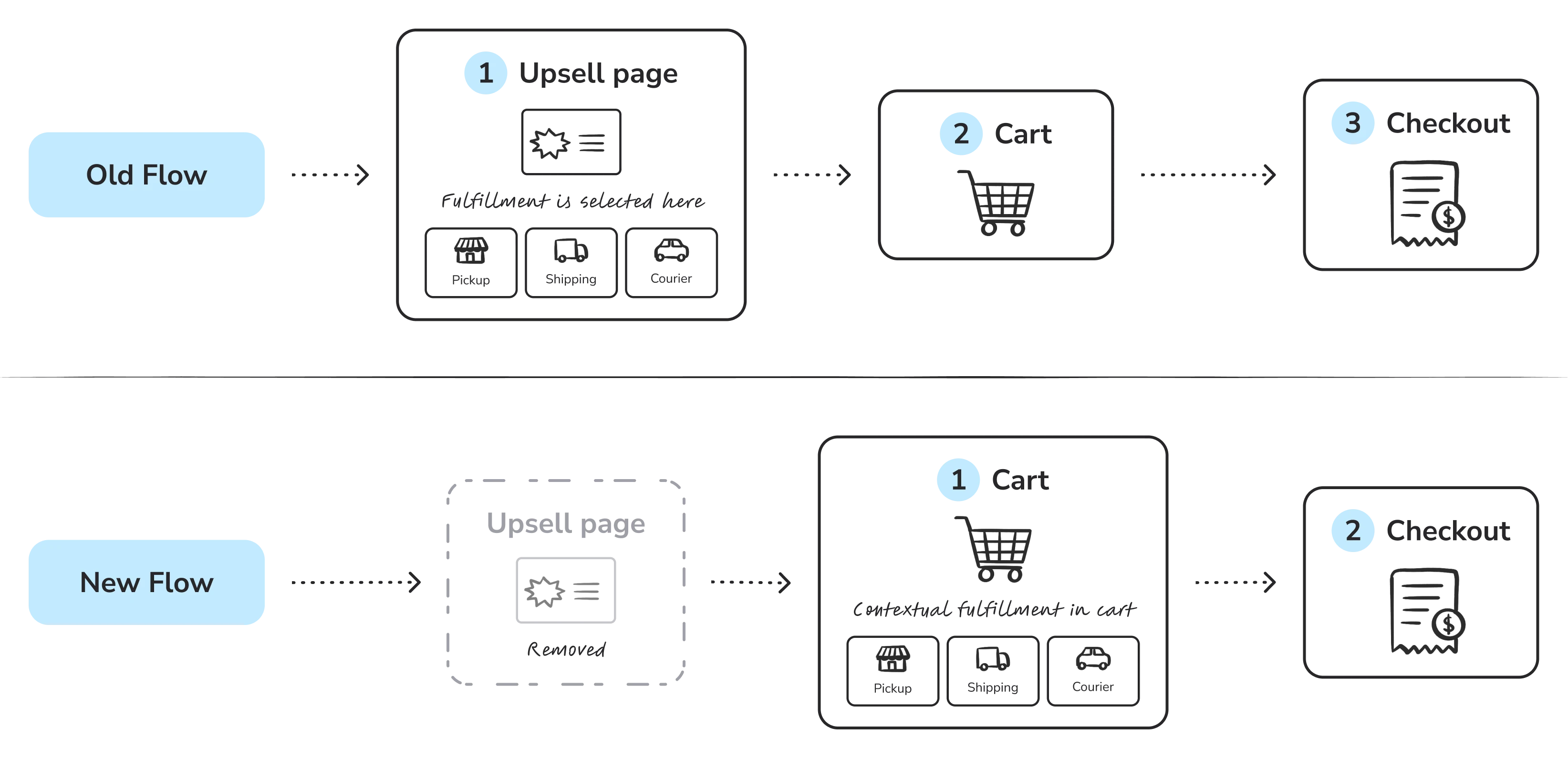
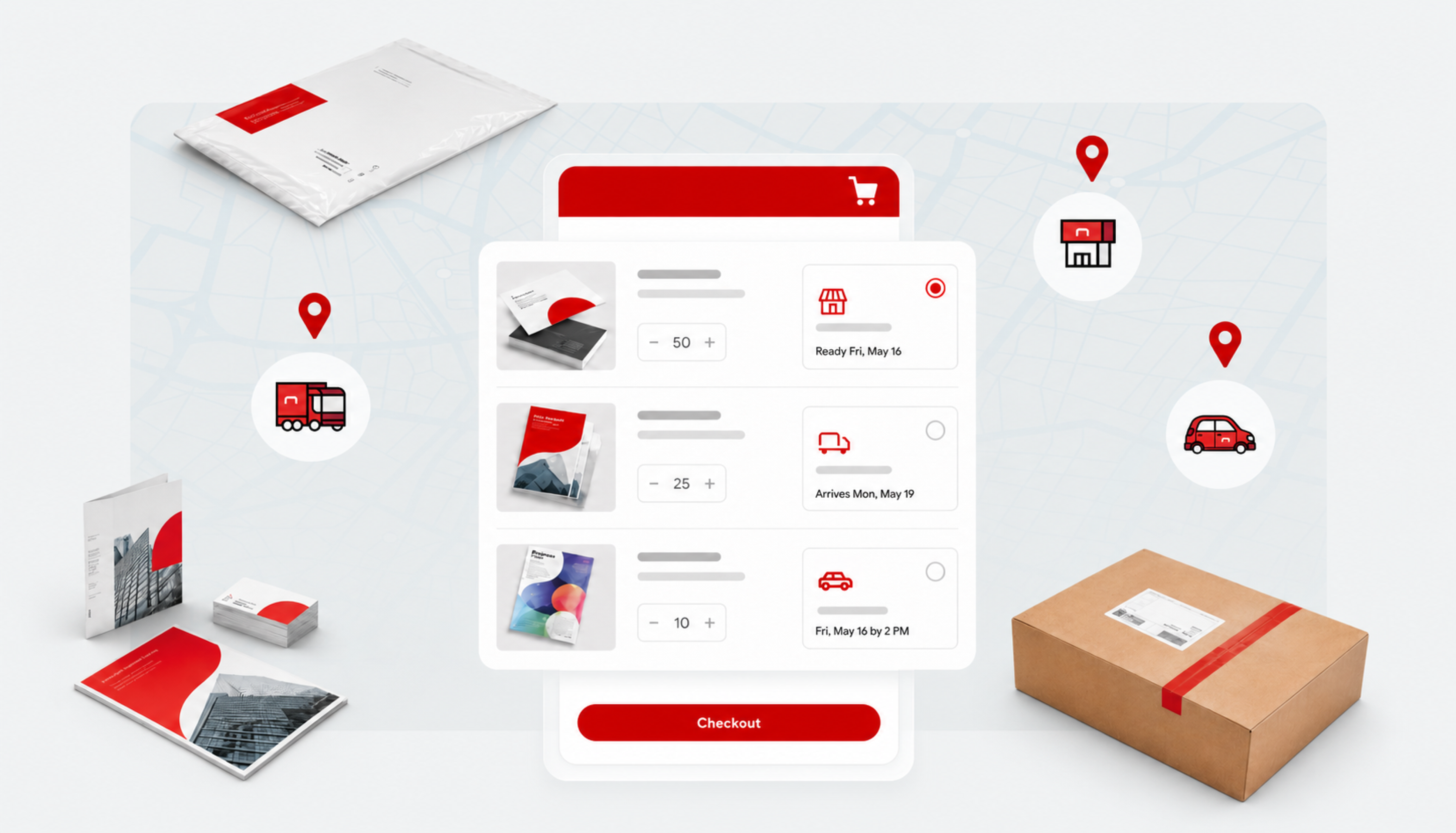
The previous experience forced customers through a separate upsell flow and limited orders to one fulfillment method. By consolidating pickup, shipping, and courier delivery inside the cart, we removed friction from a high-intent moment and unlocked mixed orders for the first time.
My work focused on building pricing confidence, supporting complex fulfillment logic, and making delivery choices easier to compare, contributing to an 18% reduction in cart abandonment and a 9.2% lift in overall sales.
Category
E-commerce / Checkout Optimization
Focus areas
Cart & checkout, fulfillment logic, interaction model, usability testing
HEAR THE STORY
01
One Order, Many Ways
Designing around how customers actually order
The project started with a business goal that reflected a real customer behavior: People do not always shop in one mode.
A customer might need business cards for next-day pickup, while sending posters to another address later in the week.
Consolidating the Path
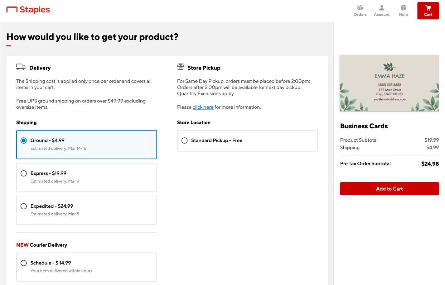
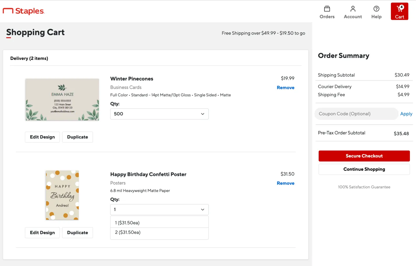
The existing flow treated fulfillment as a single order-level decision. Customers had to choose one method through a separate upsell page before reaching cart, which made mixed orders impossible and added friction before checkout.
Together with Product Managers, we advocated for a centralized cart experience where fulfillment could be managed at the item level while still keeping the total order easy to review.
Screenshot of old upsell page
Screenshot of old cart
02
Benchmarking Complexity
Identifying how leading retailers handle mixed orders
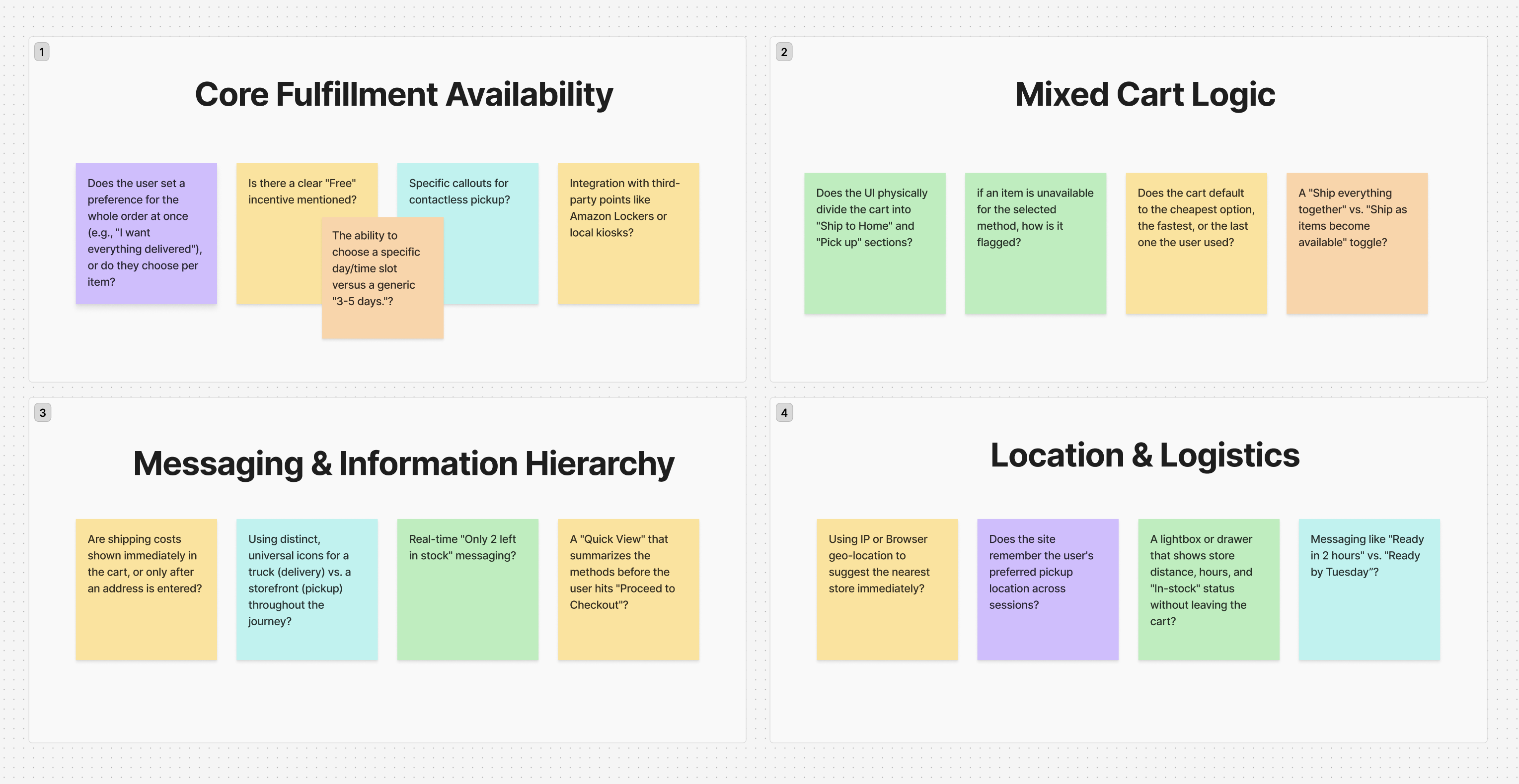
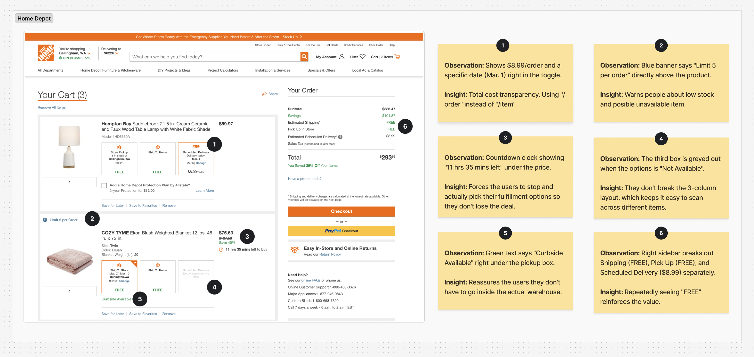
I conducted a competitive analysis of six major retailers, including Walmart and Home Depot, to understand how they handled carts with multiple delivery methods.
The strongest pattern gave customers product-level control without losing sight of the full order. They could decide where each item should go while understanding how each choice affected cost, timing, and availability. This became the foundation for the Item-Level Agency model.
Screenshot of selected research questions in FigJam
Example of competitor analysis in FigJam
Interaction Exploration
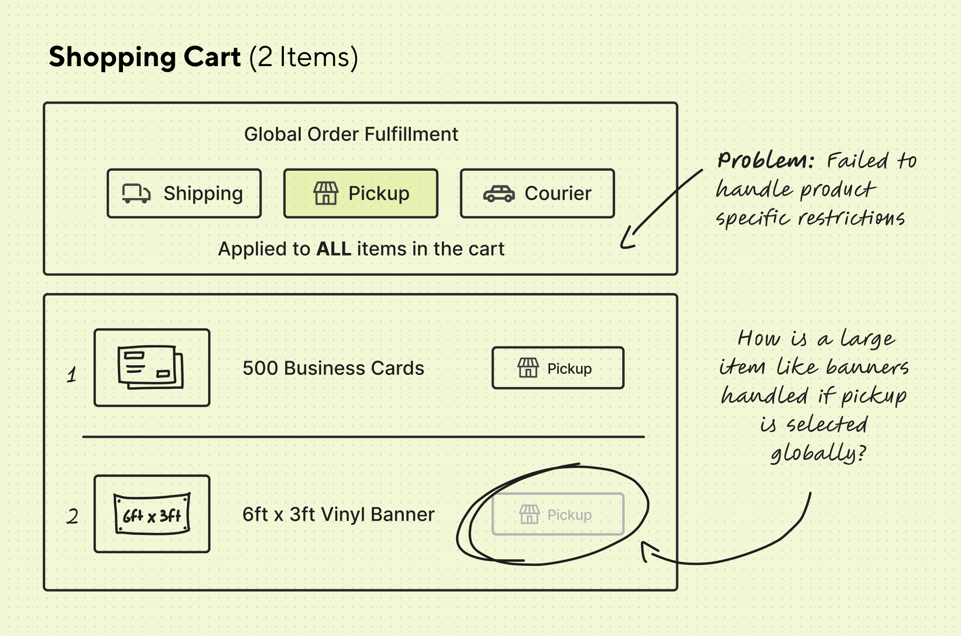
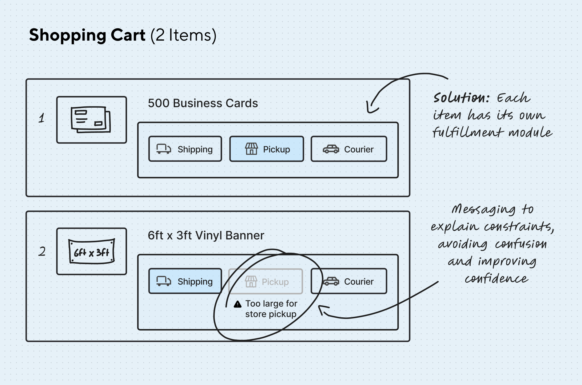
To solve the "Mixed-Order" problem, I explored both global and item-level models. The global model reduced visual density, but it hid important exceptions and made mixed orders harder to understand. The item-level model introduced more information into the cart, but gave customers the control they needed and made fulfillment rules easier to explain in context.
Global Model
Item Level Model
03
Navigating Constraints
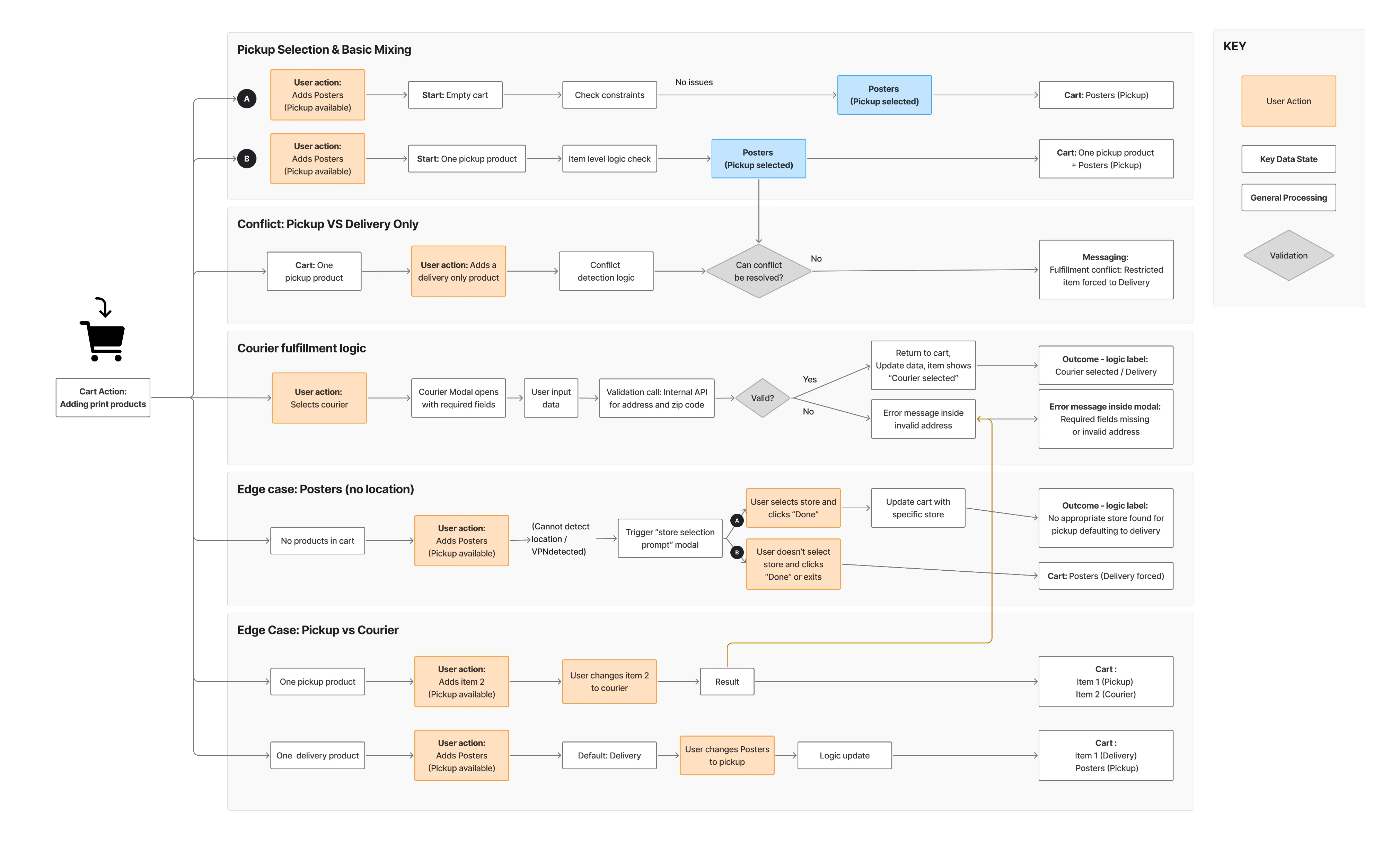
Mapping a complex logic system
Some products had location restrictions. Others had delivery-only rules, production dependencies, or timing constraints that changed depending on quantity, format, or destination.
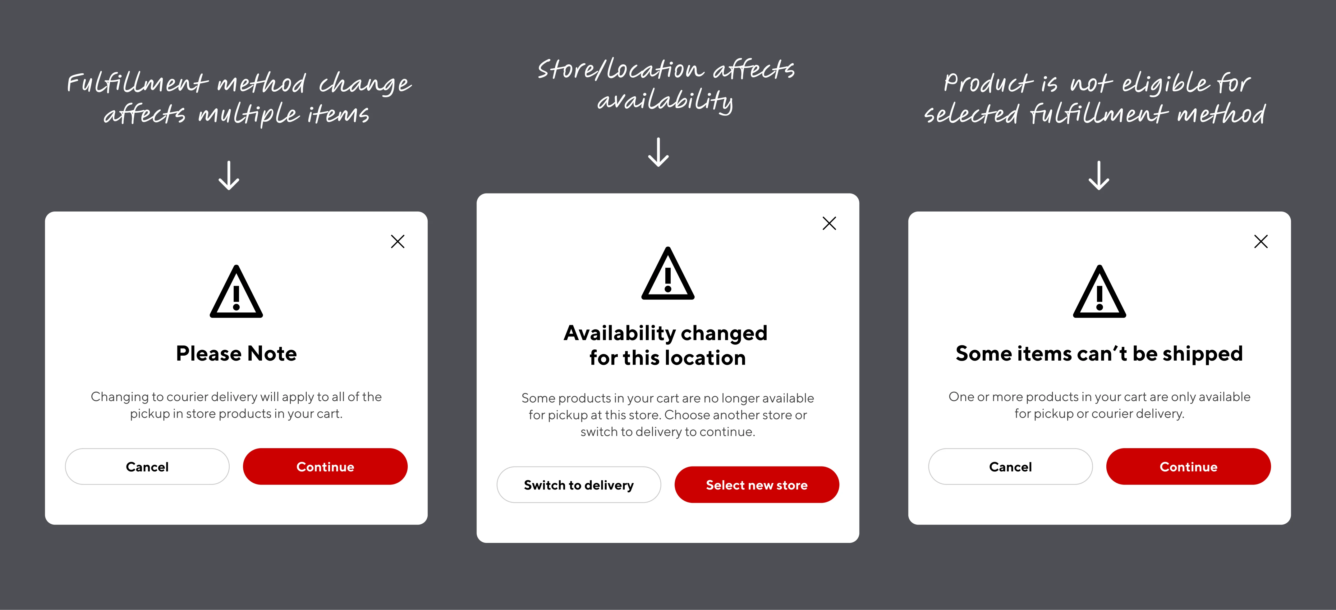
My role was to translate those operational rules into customer-facing decisions: what should be shown upfront, what could be handled as an exception, and when the system needed to interrupt the customer with a warning.
Scenarios and use cases
Making System Rules Visible
Instead of treating warnings as error states, I designed them as decision support. When a fulfillment change affected availability, timing, or another item in the cart, the message explained what changed, why it changed, and what the customer could do next.
04
Iterative Refinement
Validating the flow through unmoderated testing
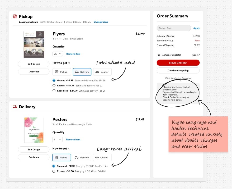
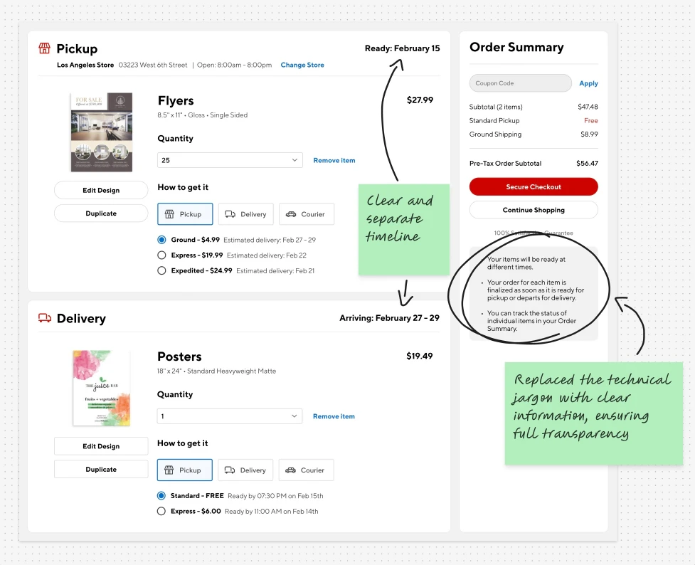
I tested whether customers could identify which fulfillment choices applied to a single item, understand how changes affected the order, and continue checkout without losing confidence.
The results showed that customers understood the idea of mixed fulfillment, but needed stronger cues to know which decisions applied to one item versus the full order. With this information I refined the layout and messaging to make item-level choices easier to scan and reduce ambiguity before checkout.
Problem
Iteration
05
Responsive Execution
Maintaining clarity across desktop, tablet and mobile.
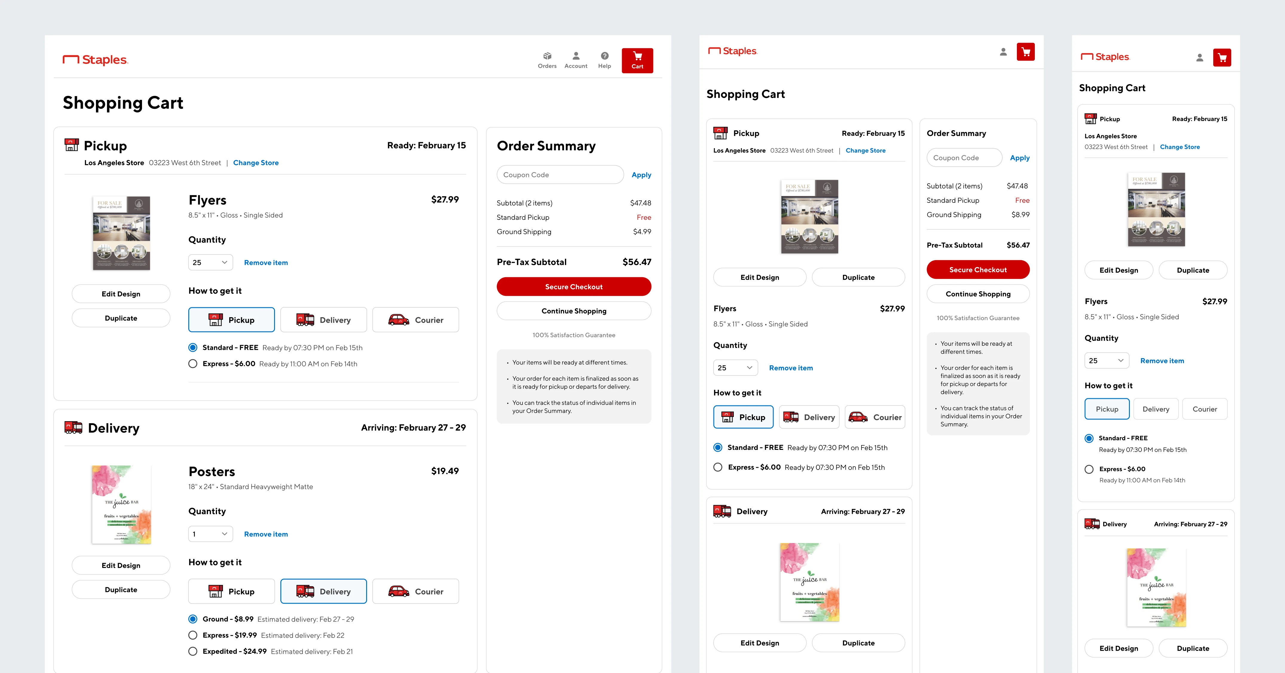
On mobile, the challenge was not simply stacking the desktop cart. Fulfillment options needed to remain visible without pushing price, timing, and checkout actions too far down the page. I adjusted the hierarchy so customers could compare options, understand availability, and continue checkout without losing context.
06
Designed to Scale
Building a fulfillment pattern with future reuse in mind.
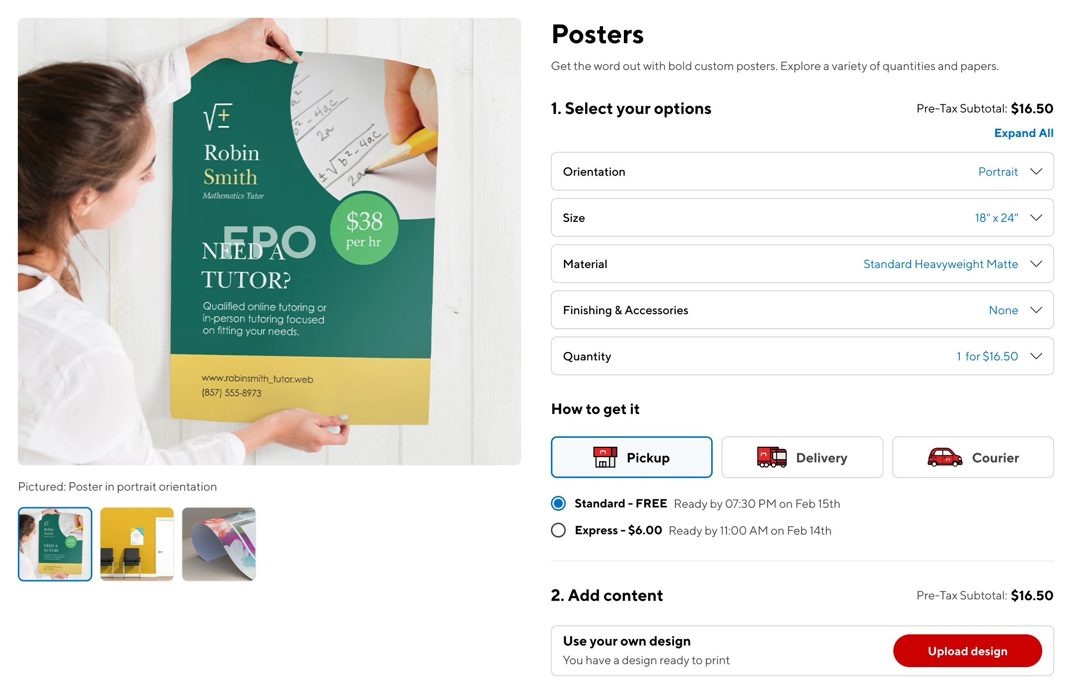
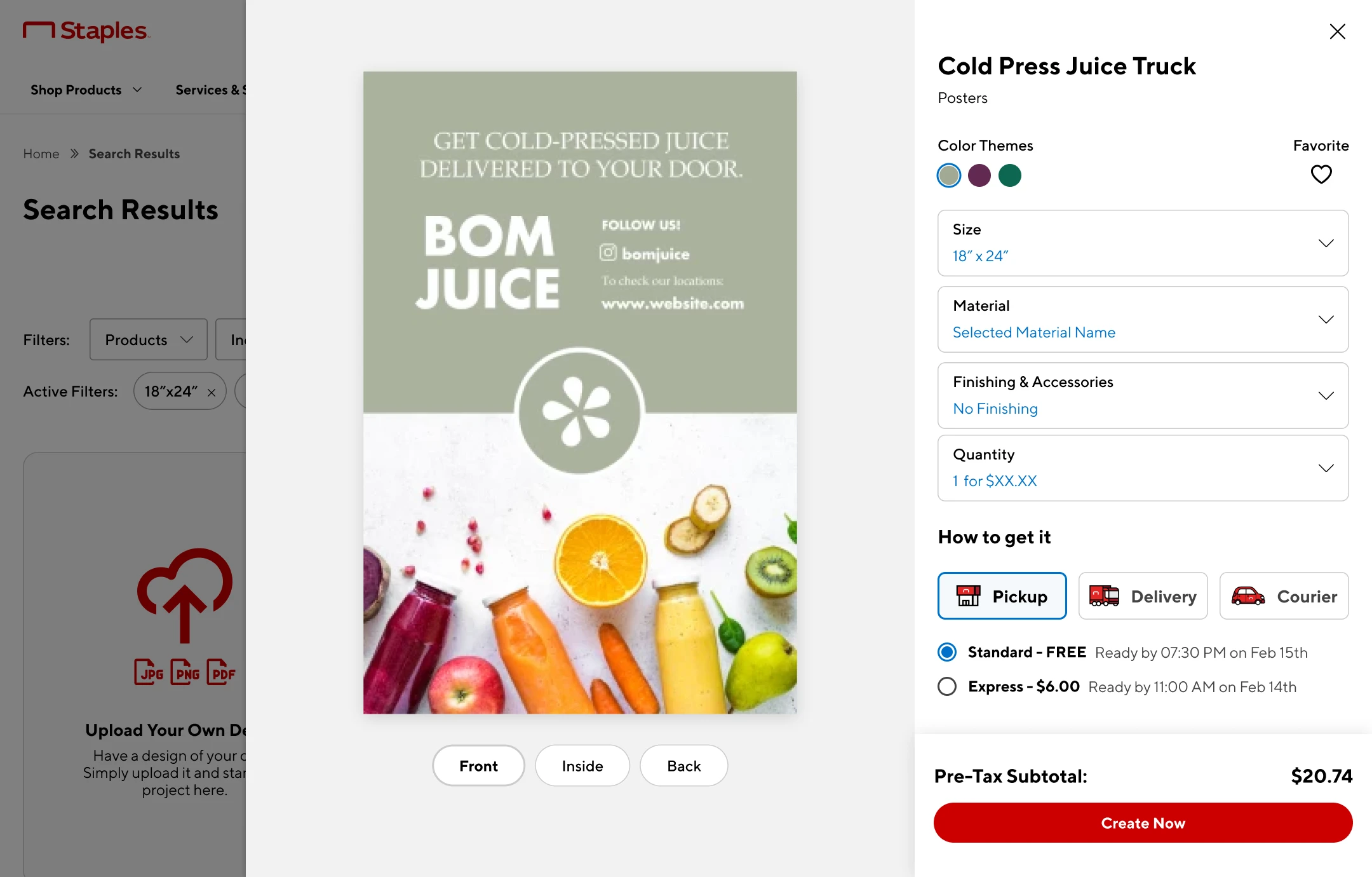
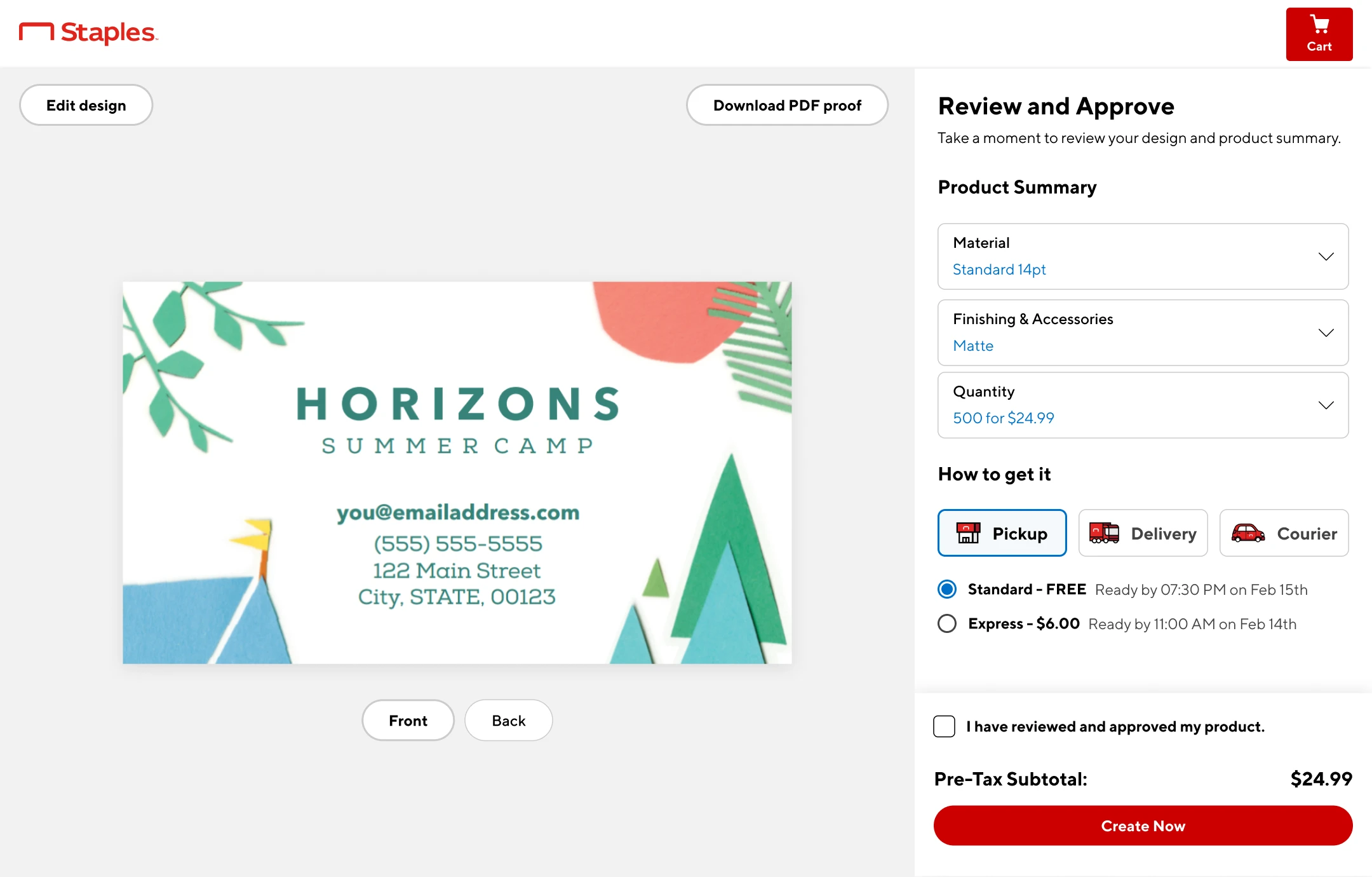
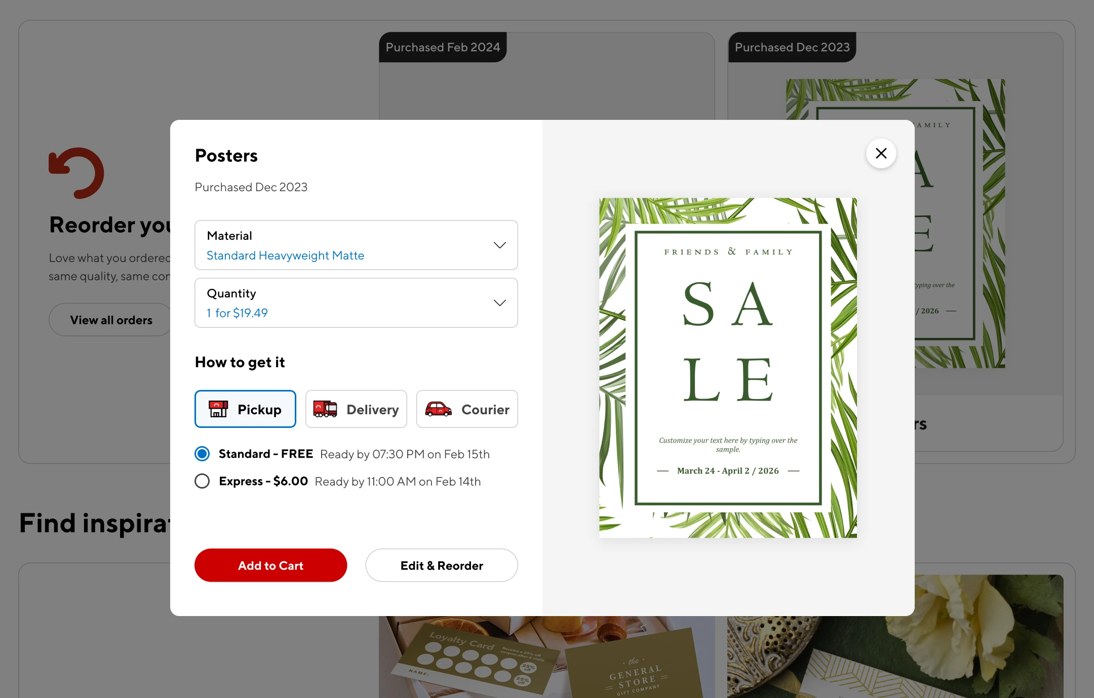
Although the component was first designed for cart and checkout, I structured it as a flexible pattern that could extend to other moments in the customer journey. By defining a consistent hierarchy for fulfillment options, availability, timing, and customer actions, the design created a foundation for future workflows without needing to reinvent the logic each time.
Product configurator
Template preview
Review and approval page
Reoder experience
07
The Impact
Overall Sales Lift
By removing the fulfillment upsell step and consolidating decisions in cart and checkout, the new flow helped more customers complete their orders.
Store Pickup Adoption
Making pickup more visible and easier to compare encouraged customers to choose a lower-cost fulfillment option.
Cart Abandonment
The redesigned flow reduced friction at the fulfillment stage, helping customers move through checkout with fewer interruptions.
From checkout friction to fulfillment confidence
In the end, the work was about helping customers feel confident before they reached checkout. They could understand their options, make different decisions for different products, and see how those choices affected the full order.
That clarity helped support a more flexible purchase flow and gave Staples a stronger foundation for future mixed-fulfillment experiences.